In every software project that has been around for a while there is of course newer code and older code. A question that often pops up at least in my mind is then: How much of the old code has actually survived over the years and is still being in use today?
And how would you visualize that in a way that makes it possible to understand the data?
A challenge
This turned out to become my challenge of the week.
I started off writing a script that iterates over all release tags we have set in the curl git repository and for every such tag, it extracts all relevant source files and runs git blame on them. With the -t --line-porcelain options, the output is really easy to parse.
For every such release tag, we get a large number of lines with different timestamps. Then the script sorts all those timestamps, iterates over them, counts how many that were done within different intervals in time and outputs those counters in a formatted line.
Iterating over several hundred tags in a code base of curl size and running git blame like this is not a quick operation. On my decently fast machine, a full such round takes well over an hour. Admittedly there is probably ways the algorithm can be improved.
gnuplot
Once all the data is written, it is converted into a visualization using gnuplot. I needed to experiment. I had to experiment a bit to learn how to do filledcurves.
Take 1
My first take split up the age just as a percentage. How large share of the code has been changed within how many months.
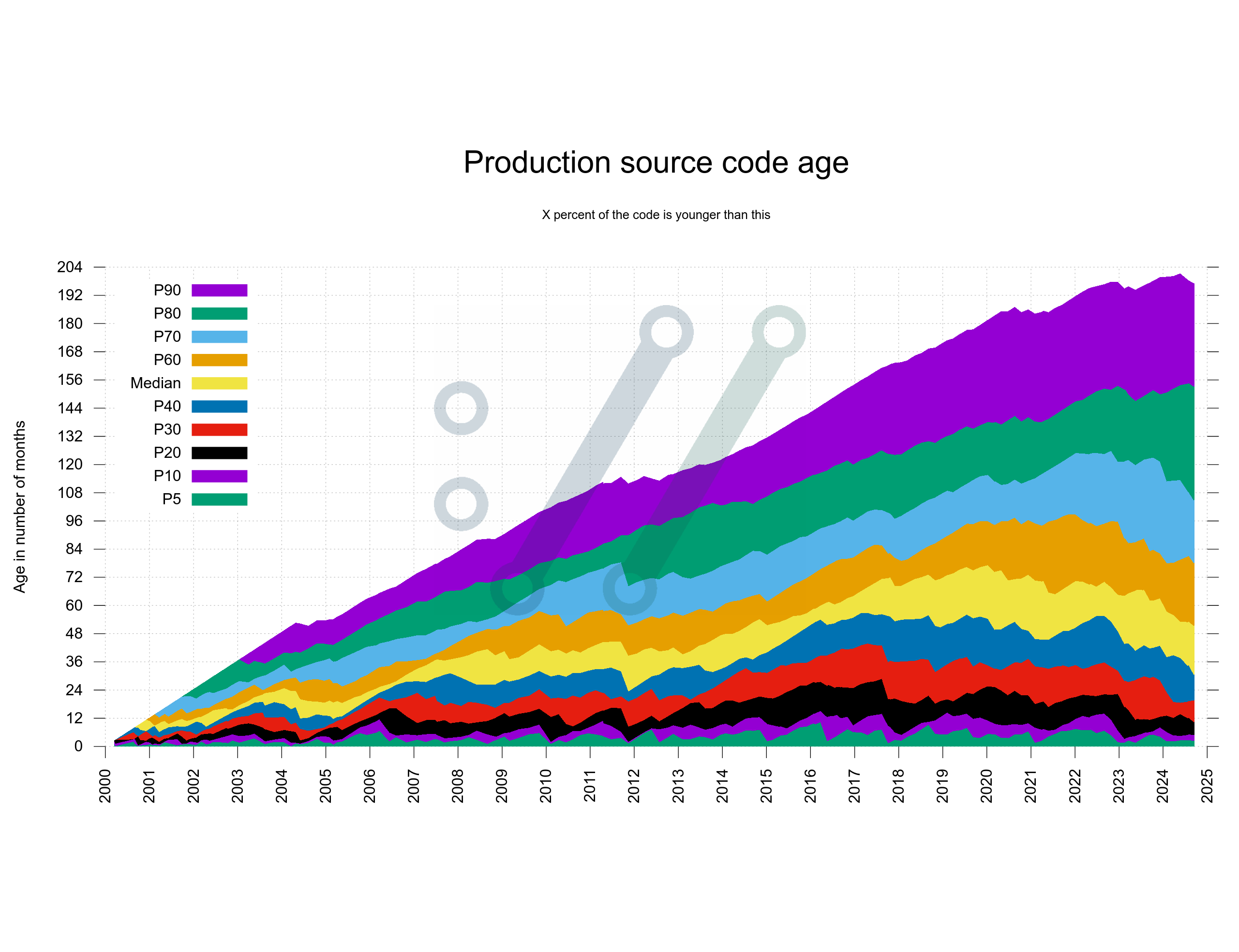
Turned out rather hard to interpret and understand.
Take 2
The source code is always 100%, so how large share of the source code is written within which two-year segment?
I decided to split the time in two-year segments only to keep the number of segments down a little.
Also, I moved the labels to the right side as it is the side where you are most likely interested in reading them. I had to put the legend outside of the graph.
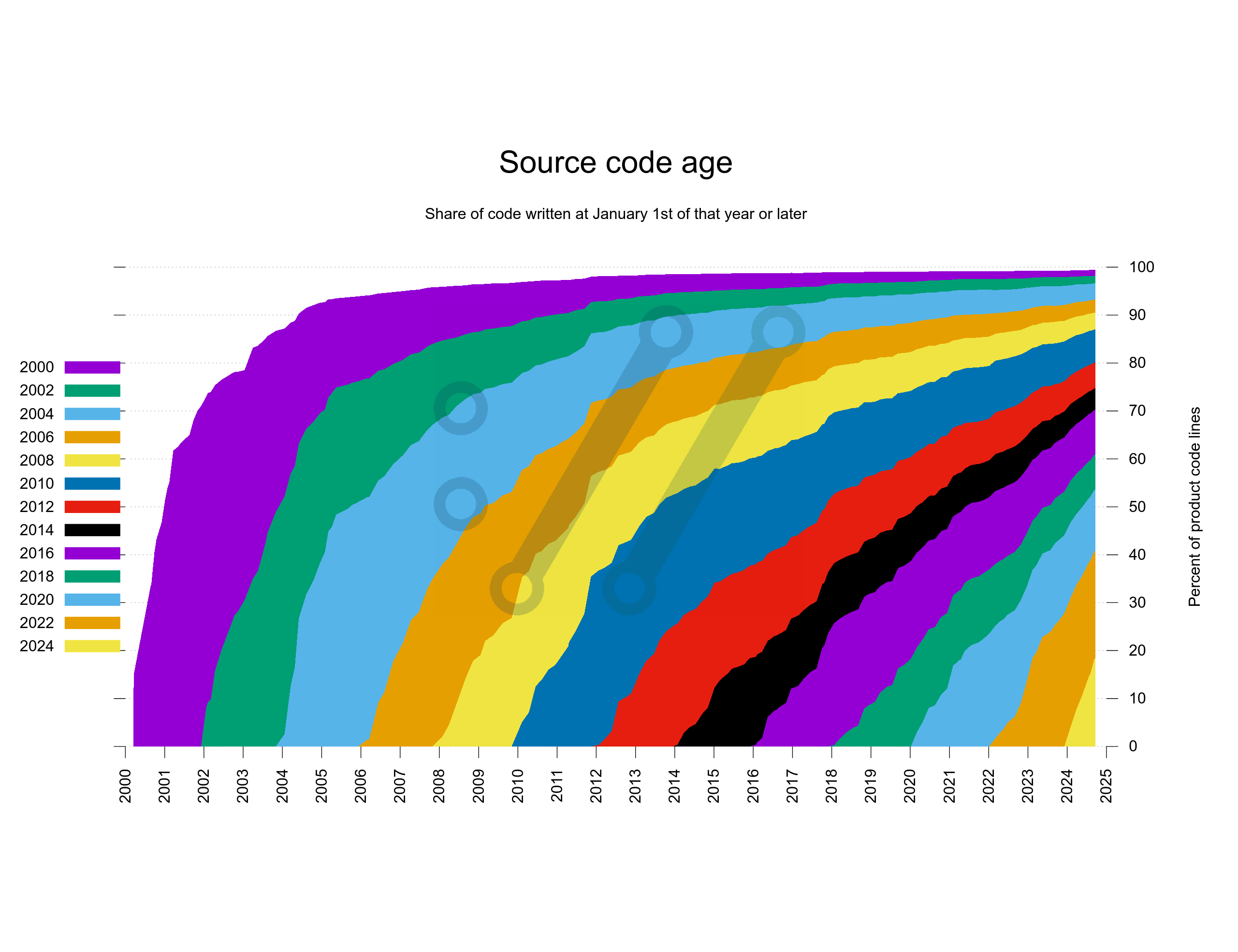
While I think this version turned out pretty cool, the actual number of lines of code and the growth of the code base is completely invisible in this version.
Take 3
What if I would do the take 2 version but do it based on actual number lines instead. I poked the script again, restarted it and let it run for another hour or two.
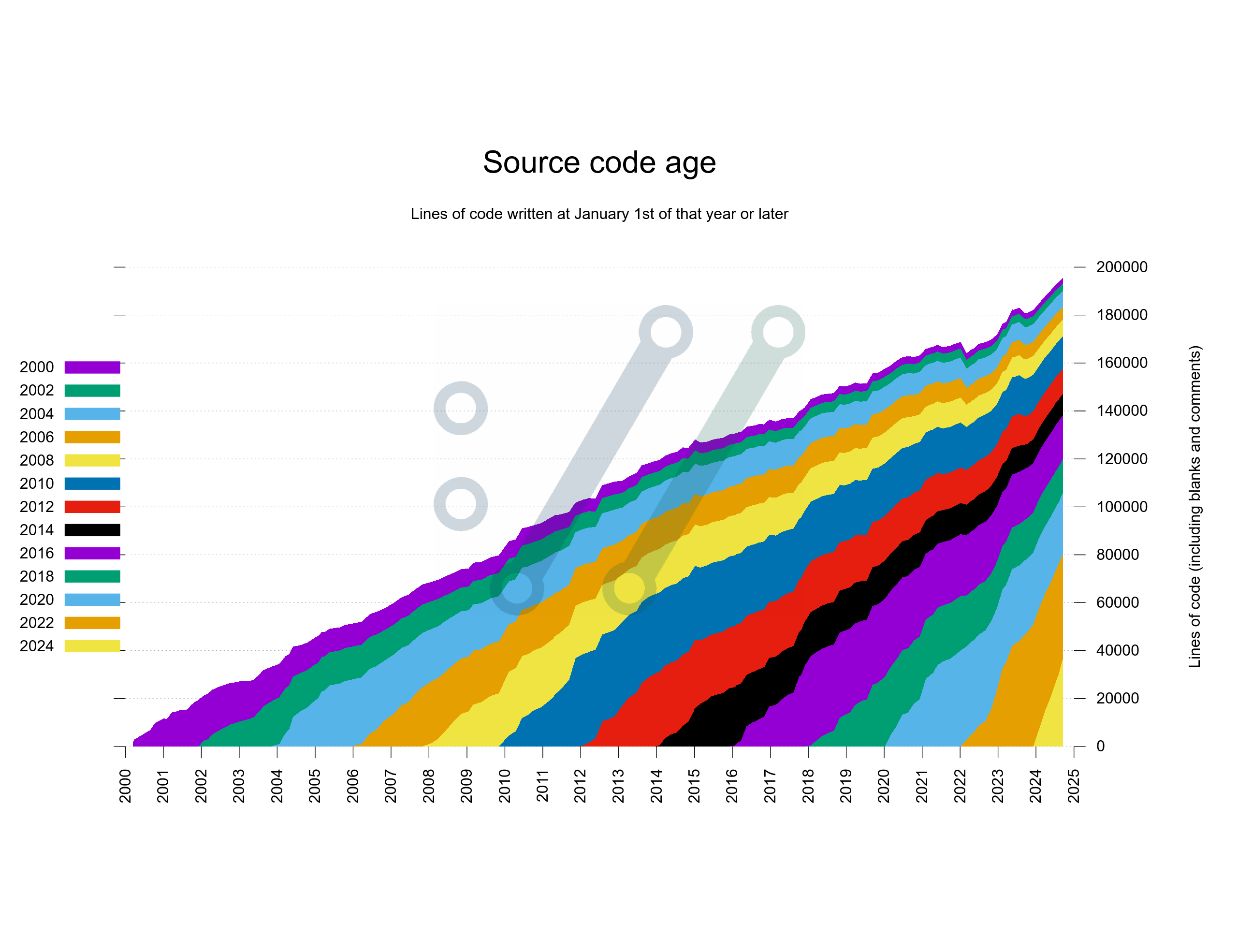
Better! This version shows the segments in a way that properly reflects the actual number of lines over time. It beats the weird percentage take from above.
Still, having the oldest code slide over on top of the graph like this and have newer code appear from below might not be the best way to illustrate this data. What if I instead swapped it around so that the graph would keep the oldest code at the bottom and add newer code over that?
Take 4
I think this shows perfectly fine how the exact same data can be experienced so much better if shown just slightly differently.
In this version below, I also experimented a bit on how to name the segments in the legend as someone pointed out that it may not be entirely obvious to everyone that I do two-year segments.
I could also move the legend into the graph again here.
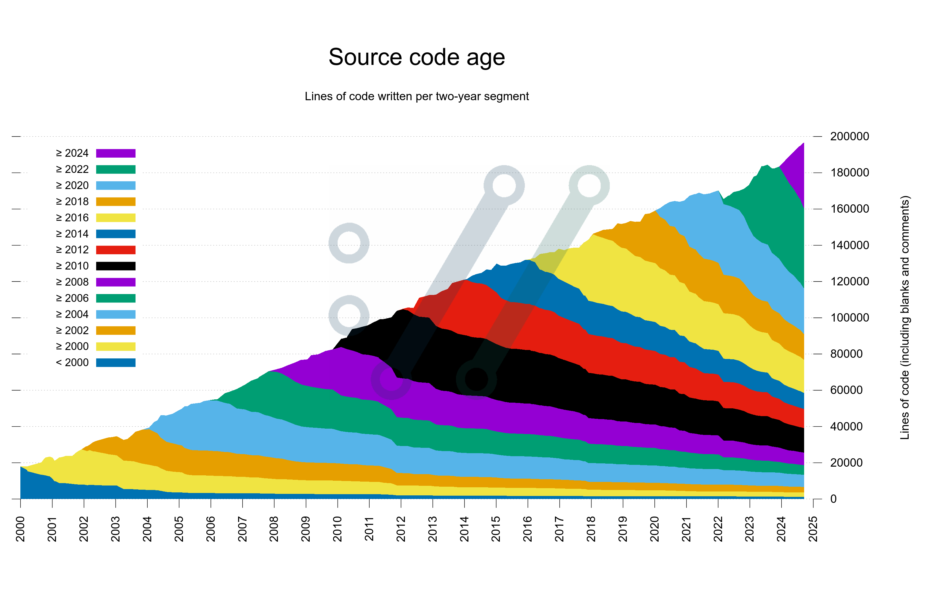
Pedantic viewers of this graph will spot how the number of lines of code here is slightly different than the separate line of code graph shown in the curl dashboard. This, because git blame includes all the lines and the other graph is done using cloc which excludes blank lines – and probably some other minor differences as well.
Take 4 is the version of the scripts that starting now will be included in the curl dashboard.
Takeaways
More than 50% of existing curl code was written since 2020.
About 25% of existing code was written before 2014.
Almost 10% was written before 2008.
1254 lines (0.64%) are still left in the code that were written before the year 2000.
No, I don’t know how this compares to other projects of similar age.
The scripts
If you want to play with them against your own git repositories, you will notice that there are some curl-specific assumptions in there that you need to address, but that should not be difficult to patch.
Follow-up
Kees Cook wrote an adaptation of these scripts to generate the same graph for the Linux kernel. In Python and using multiple threads.


Well done. I think a continous color palette would be a better choice then this categrical one. That would make it clearer that code from 2001 is more similar to code from 2002 than code from 2020
@Kaligule: yeah, I totally agree with that. The current palette and color choice just happen to be the default set that gnuplot picks when no specific colors are selected by the script. I will experiment with a better set going forward.