The original logo for the curl project was created in 1998 by Henrik Hellerstedt. When we started version controlling the web site contents in June 2001 it had already been revised slightly and it looked like this

I subsequently did the slightly refreshed version that’s been visible on the site since early 2003 which sort of emphasized the look by squeezing the letters together. The general “cURL” look was obviously kept.
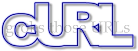
It was never considered a good-looking logo by anyone. People mostly at best thought it was cute because it looked goofy and it helped provide the web site with a sort of retro feeling. Something that was never intended.
(As you can see I shortened the tag line slightly between those two versions.)
Over the years I’ve tried to refresh the logo and even gently tried to ask around for help to get it revamped, but it was never done and my own futile attempts didn’t end up in any improvements.
The funny casing of the word cURL might’ve contributed to the fact that people considered it ugly. It came with the original naming of the project that was focused on the fact that we work with URLs. A client for URLs could be cURL. Or if you’d pronounce the c as “see”, you’d “see URL”. The casing is really only used in the logo these days. We just call it curl now. The project is curl, the command line tool is curl and even I have started to give up somewhat and have actually referred to libcurl as the curl library several times. “curl” with no upper case being the common denominator.
When I got this offer to refresh the logo this time, I was a bit skeptical since attempts had failed before, but what the heck, we had nothing to lose so sure, please help us!
We started out with their own free-style suggestions on a new logo. That proved these guys are good and have an esthetic sense for this. To me that first set also quite clearly showed me that the funny casing have to go. A lower case version seemed calmer, more modern and more in line with our current view of the naming.
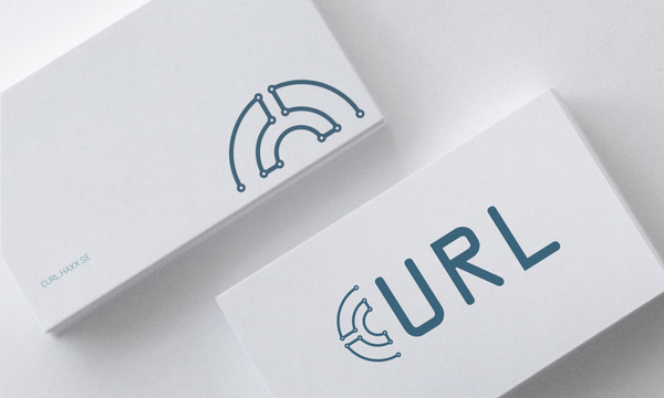
As an example from their first set, a clean and stylish version that tried to use the letter c as a sort of symbol. Unfortunately it makes you mostly read “URL”.
As step two, I also suggested we’d try to work with :// (colon slash slash) somehow as a symbol, since after all the :// letter sequence is commonly used in all the URL formats that curl supports. And it is sort of a global symbol for URLs when you start to think about it. Made sense to me.
Their second set of logo versions were good. Really good. But they mostly focused on having the :// symbol to the left of ‘curl’ and that made it look a bit weird. Like “:// curl” – which looks so strange when you’re used to seeing URLs. They also did some attempts with writing it “c:URL” and having the // as part of the U letter like “c://RL” but those versions felt too crazy and ended more funny-looking than cool.
An example from the second set with a colon-slash-slash symbol on the left side:
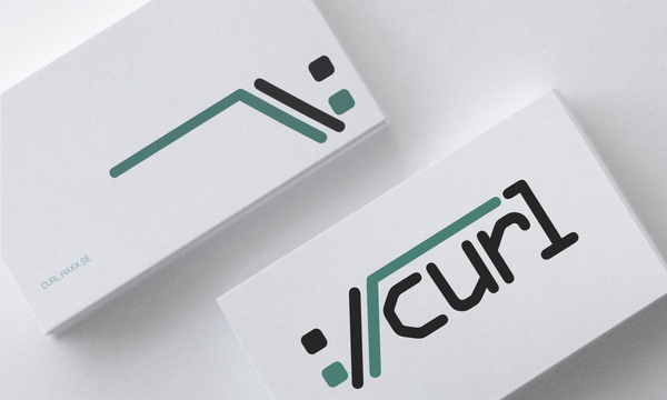
The third set of logos were then made for us with various kinds of :// variations put on the right side of the curl, the curl in lowercase only.
There, among that third set of suggestions, there was one that was a notch better than the rest. The new curl logo. We made it.
I offer you: the curl logo of 2016.
Used in a real-life like situation:
and the plan is as this image shows, to be able to use the colon-slash-slash symbol stand-alone:
 The new curl logo is made by Soft Dreams. Thanks a lot for this stellar work!


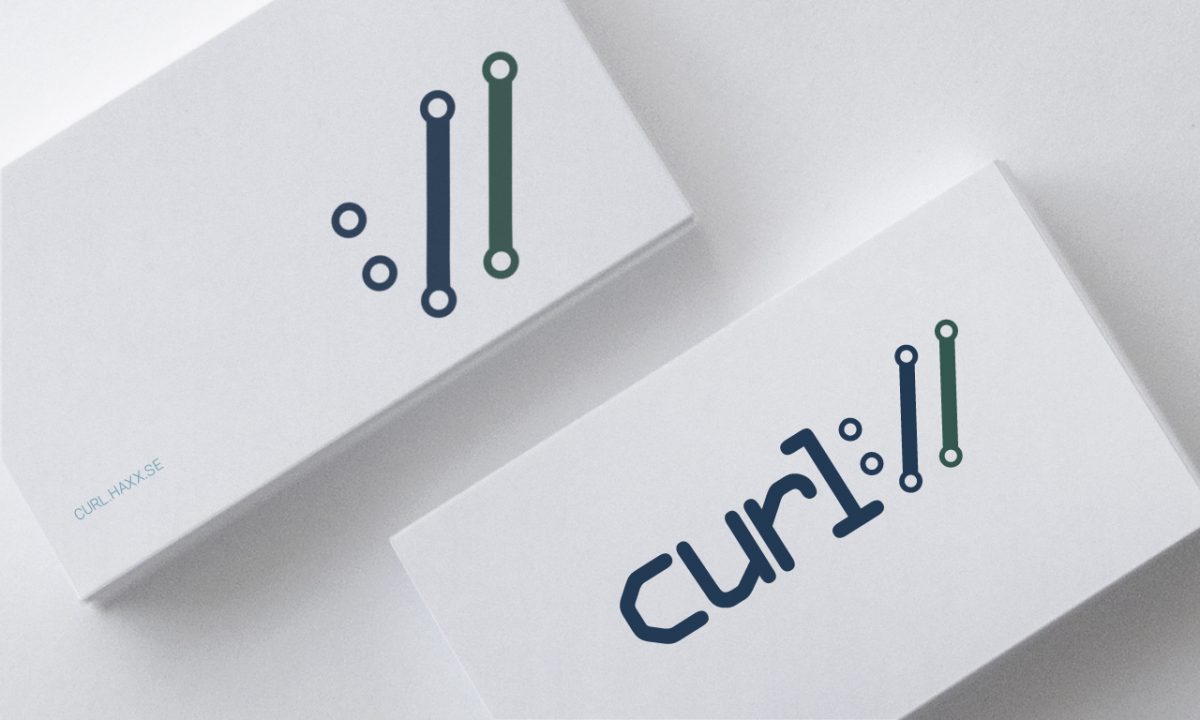
Stellar logo design from Soft Dreams! Next step…t-shirts? 🙂
no, stickers!
I intend to get tshirts/hoodies going at least to allow people to order some. Stickers too, but I figure I’ll get myself a huge bunch and hand out when I meet people or send them out myself. Just because stickers are more made to get produced in large quantities and sent to a single address…
Nice!
Please make available logo with transparent background (if white background is not part of the logo)