
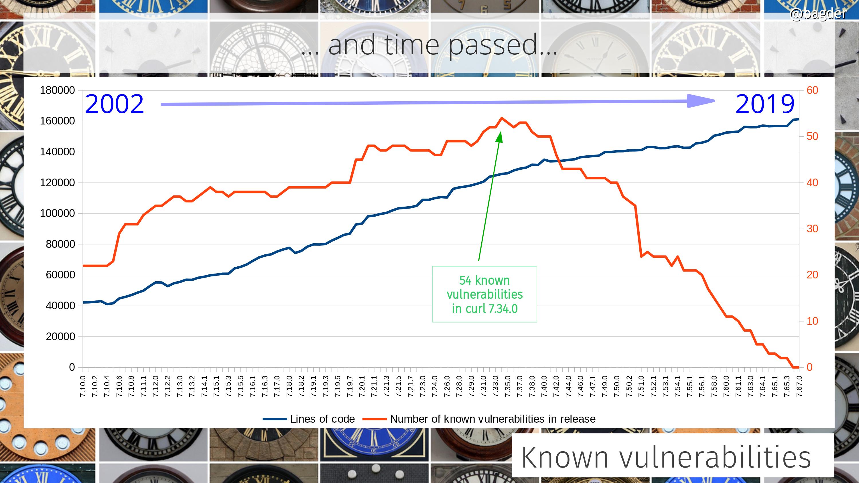
When I wrote up my looong blog post for the curl’s 22nd anniversary, I vacuumed my home directories for all the leftover scripts and partial hacks I’d used in the past to produce graphs over all sorts of things in the curl project. Being slightly obsessed with graphs, that means I got a whole bunch of them.
I made graphs with libreoffice
I dusted them off and made sure they all created a decent CSV output that I could use. I imported that data into libreoffice’s calc spreadsheet program and created the graphs that way. That was fun and I was happy with the results – and I could also manually annotate them with additional info. I then created a new git repository for the purpose of hosting the statistics scripts and related tools and pushed my scripts to it. Well, at least all the ones that seemed to work and were the most fun.
Having done the hard work once, it felt a little sad to just have that single moment snapshot of the project at the exact time I created the graphs, just before curl’s twenty-second birthday. Surely it would be cooler to have them updated automatically?
How would I update them automatically?
I of course knew of gnuplot since before as I’ve seen it used elsewhere (and I know its used to produce the graphs for the curl gitstats) but I had never used it myself.
How hard can it be?
I have a set of data files and there’s a free tool available for plotting graphs – and one that seems very capable too. I decided to have a go.
Of course I struggled at first when trying to get the basic concepts to make sense, but after a while I could make it show almost what I wanted and after having banged my head against it even more, it started to (partially) make sense! I’m still a gnuplot rookie, but I managed to tame it enough to produce some outputs!
The setup
I have a set of (predominantly) perl scripts that output CSV files. One output file for each script basically.
The statistics scripts dig out data using git from the source code repository and meta-data from the web site repository, and of course process that data in various ways that make sense. I figured a huge benefit of my pushing the scripts to a public repository is that they can be reviewed by anyone and the output should be possible to be reproduced by anyone – or questioned if I messed up somewhere!
The CSV files are then used as input to gnuplot scripts, and each such gnuplot script outputs its result as an SVG image. I selected SVG to make them highly scalable and yet be fairly small disk-space wise.
Different directory names
To spice things up a little, I decided that each new round of generated graph images should be put in a newly created directory with a random piece of string in its name. This, to make sure that we can cache the images on the curl web site very long and still not have a problem when we update the dashboard page on the site.
Automation
On the web site itself, the update script runs once every 24 hours, and it first updates its own clone of the source repo, and the stats code git repo before it runs over twenty scripts to make CSV files and the corresponding SVGs.
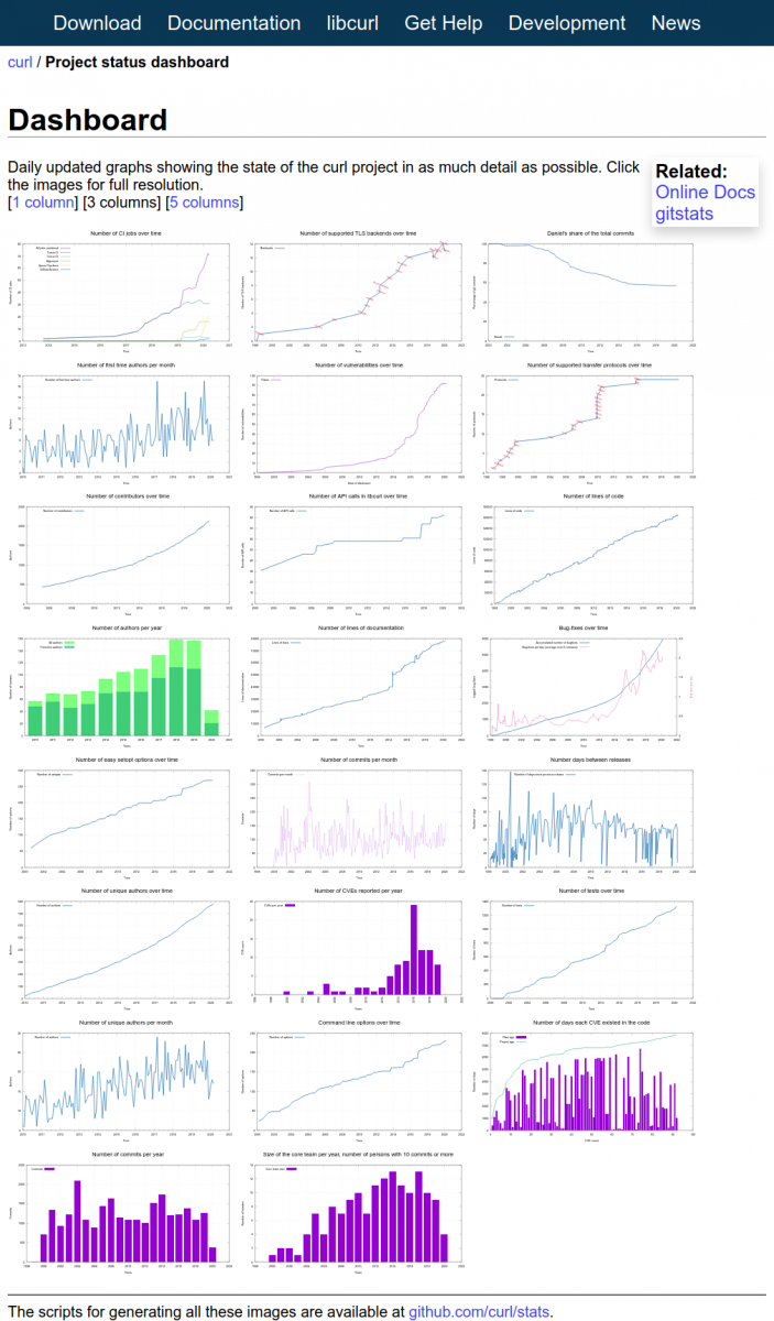
A dashboard
I like to view the final results as a dashboard. With over 20 up-to-date graphs showing the state of development, releases, commits, bug-fixes, authors etc it truly gives the reader an idea of how the project is doing and what the trends look like.
I hope to keep adding to and improving the graphs over time. If you have ideas of what to visualize and add to the collection, by all means let me know!
Screenshot
At the time of me writing this, the dashboard page looks like below. Click the image to go to the live dashboard.
For other projects?
Nothing in this effort makes my scripts particularly unique for curl so they could all be used for other projects as well – with little to a lot of hands on required. My data extraction scripts of course get and use data that we have stored, collected and keep logged in the project etc, and that data and those logs are highly curl specific.