
This is an intersection of two of my obsessions: graphs and vulnerability data for the curl project.
In order to track and follow every imaginable angle of development, progression and (possible) improvements in the curl project we track and log lots of metadata.
In order to educate and inform users about past vulnerabilities, but also as a means for the project team to find patterns and learn from past mistakes, we extract and document every detail.
Do we improve?
The grand question. Let’s get back to this a little later. Let’s first walk through some of the latest additions to the collection of graphs on the curl dashboard.
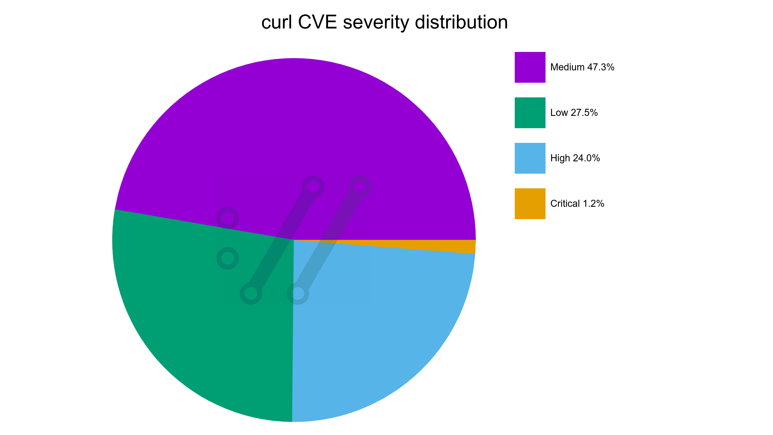
The here data is mostly based on the 167 published curl vulnerabilities to date.
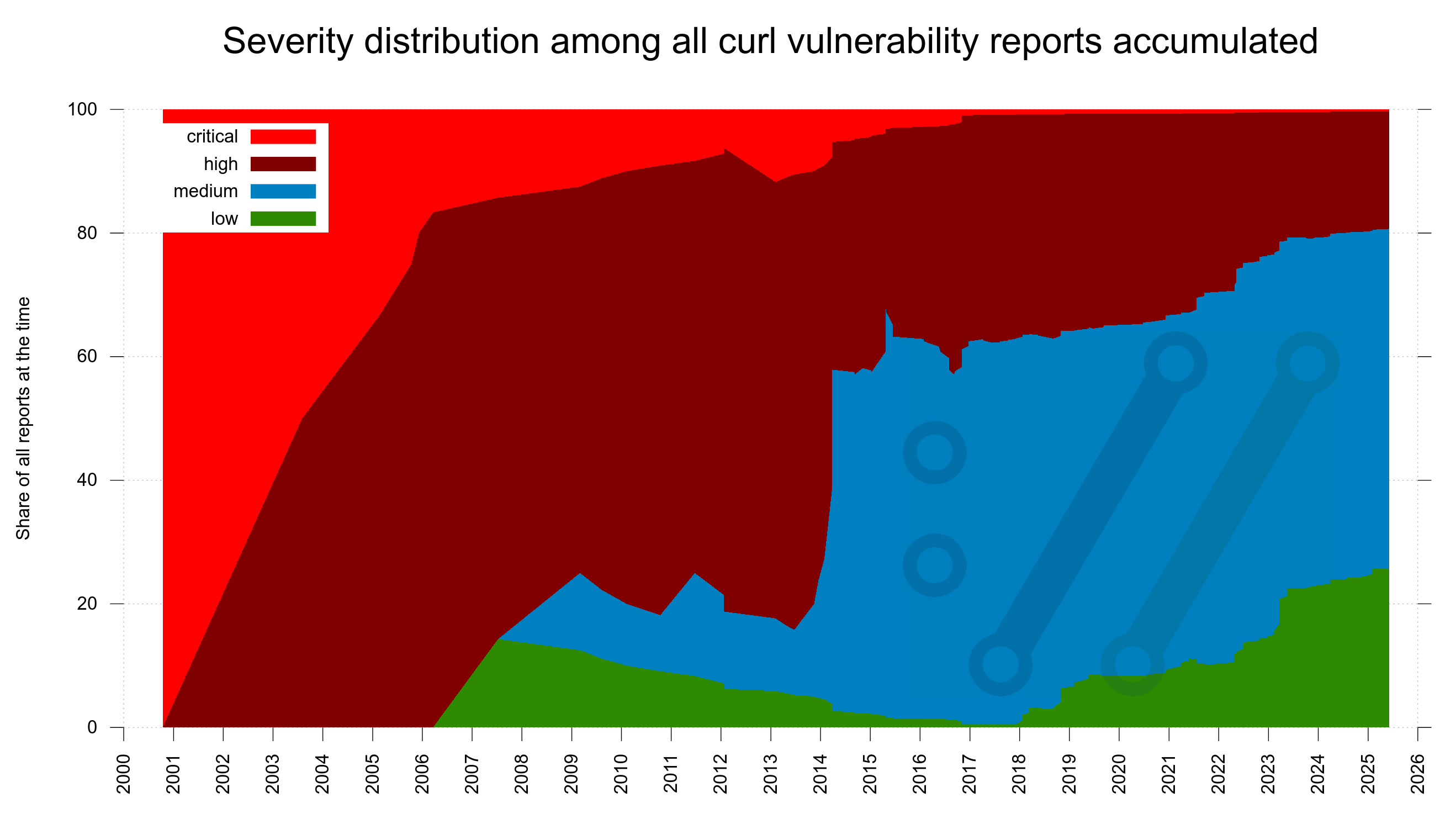
vulnerability severity distribution
Twenty years ago, we got very few vulnerability reports. The ones we got were only for the most serious problems and lots of the smaller problems were just silently fixed without being considered anything else than bugs.
Over time, security awareness has become more widespread and nowadays many more problems are reported. Because people are more vigilant, more people are looking and problems are now more often considered security problems. In recent years also because we offer monetary rewards.
This development is clearly visible in this new graph showing the severity distribution among all confirmed curl vulnerabilities through time. It starts out with the first report being a critical one, adding only high severity ones for a few years until the first low appears in 2006. Today, we can see that almost half of all reports so far has been graded medium severity. The dates in the X-axis are when the reports were submitted to us.
Severity distribution in code
One of the tricky details with security reports is that they tend to identify a problem that has existed in code already for quite some time. For a really long time even in many cases. How long you may ask? I know I did.
I created a graph to illustrate this data already years ago, but it was a little quirky and hard to figure out. What you learn after a while trying to illustrate data over time as a graph, is sometimes you need to try a few different ways and layouts before it eventually “speaks” to you. This is one of those cases.
For every confirmed vulnerability report we receive, we backtrack and figure out exactly which the first release was that shipped the vulnerability. For the last decades we also identify the exact commit that brought it and of course the exact commit that fixed it. This way, we know the exact age of every vulnerability we ever had.
Hold on to something now, because here comes an information dense graph if there ever was one.
- There is a dot in the graph for every known vulnerability
- The X-axis is the date the vulnerability was fixed
- The Y-axis is the number of years the flaw existed in code before we fixed it
- The color of each dot indicates the severity level of the vulnerability (see the legend)
To guide the viewer, there is also a few diagonal lines. They show the release dates of a number of curl versions. I’ll explain below how they help.
Now, look at the graph here and I’ll continue below.
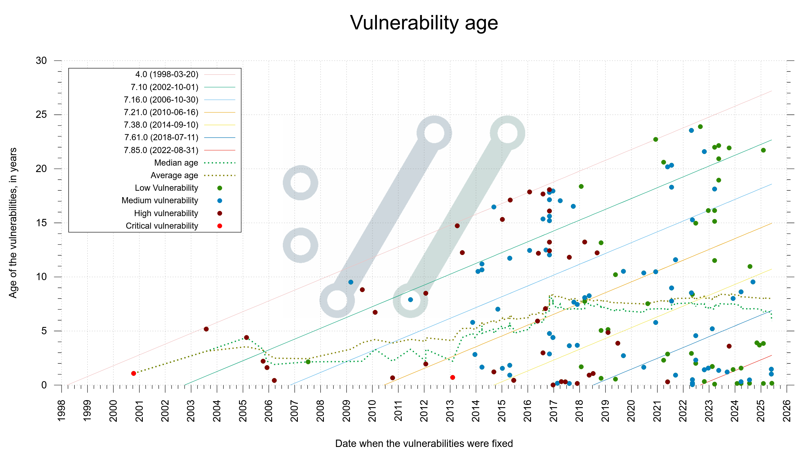
Yes, you are reading it right. If you count the dots above the twenty year line, you realize that no less than twelve of the flaws existed in code that long before found and fixed. Above the fifteen year line is almost too many to even count.
If you check how many dots that are close to the the “4.0” diagonal line, it shows how many bugs that have been found throughout the decades that were introduced in code not long after the initial curl release. The other diagonal lines help us see around which particular versions other bugs were introduced.
The green dotted median line we see bouncing around is drawn where there are exactly as many older reports as there are newer. It has hovered around seven years for several recent years but has fallen down to about six recently. Probably too early to tell if this is indeed a long-term evolution or just a temporary blip.
The average age is even higher, about eight years.
You can spot a cluster of fixed issues in 2016. It remains the year with most number of vulnerabilities reported and fixed in curl: 24. Partly because of a security audit.
A key take-away here is that vulnerabilities linger a long time before found. It means that whatever we change in code today, we cannot see the exact effect on vulnerability frequency until many years into the future. We can’t even know exactly how long time we need to tell for sure.
Current knowledge, applied to old data
The older the projects gets, the more we learn about mistakes we did in the past. The more we realize that some of the past releases were quite riddled with vulnerabilities. Something nobody knew back then.
For every release ever made from the first curl release in 1998 we increase a counter for every vulnerability we now know was present. Make it a different color depending on vulnerability severity.
If we lay all this out in a graph, it becomes an interesting “mountain range” style look. In the end of 2013, we shipped a release that contained no less than (what we now know were) 87 security problems.
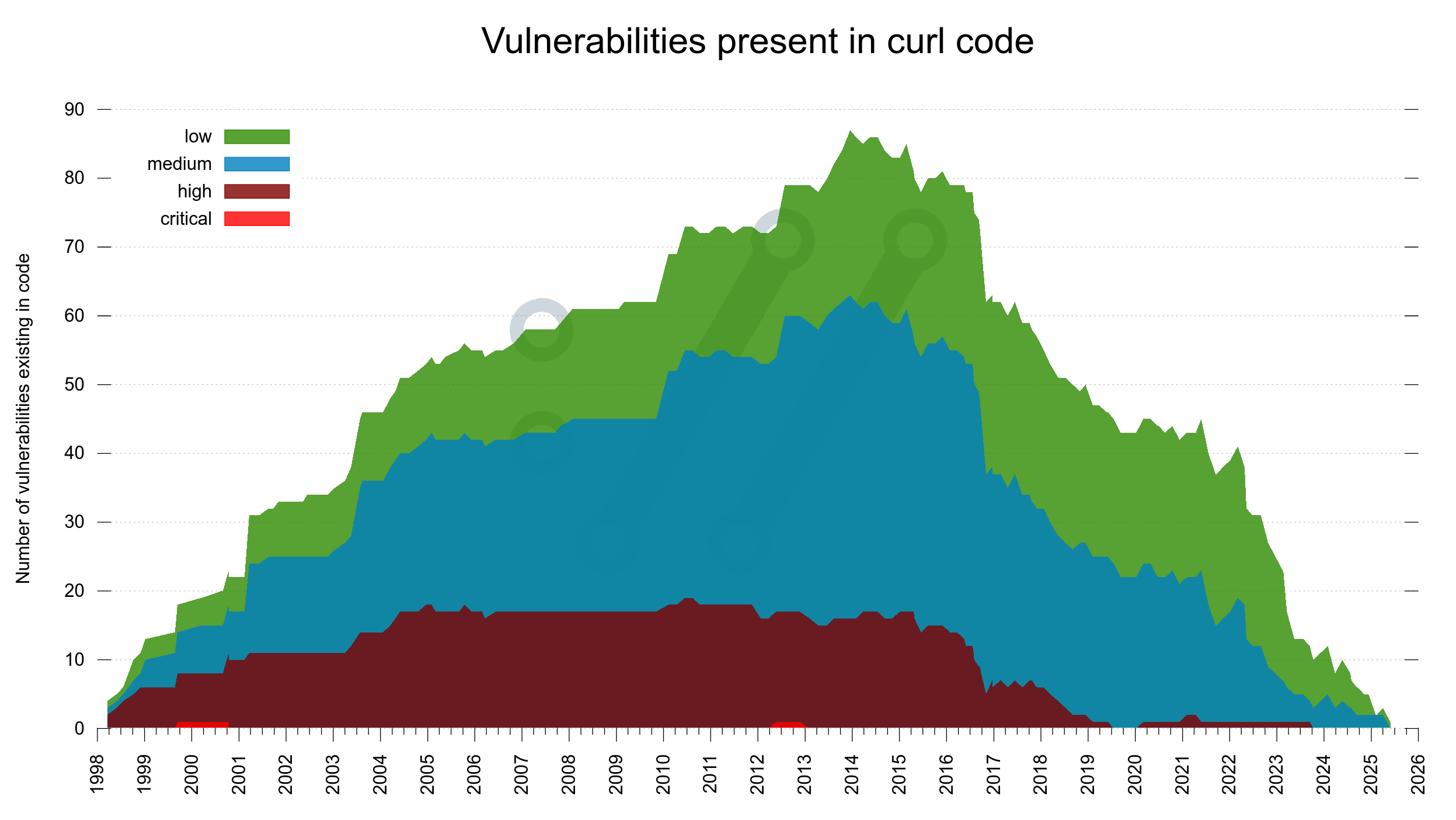
In this image we can spot that around 2017, the amount of high severity flaws present in the code decreased and they have been almost extinct since 2019. We also see how the two critical flaws thankfully only existed for brief periods.
However. Recalling that the median time for a vulnerability to exist before getting reported is six years, we know that there is a high probability that at least the rightmost 6-10 years of the graph is going to look differently when we redraw this same graph 6-10 years into the future. We simply don’t know how different it will be.
Did we do anything different in the project starting 2017? I have not been able to find any major distinct thing that stands out. We still only had a dozen CI builds but we started fuzzing curl that year. Maybe that is the change that is now visible?
C mistakes
curl is written in C and C is not a memory-safe language. People keep suggesting that we should rewrite it in other languages. In jest and for real. (Spoiler: we won’t rewrite it in any language.)
To get a feel for how much the language itself impacts our set of vulnerabilities, we analyze every flaw and assess if it is likely to have been avoided had we not used C. By manual review. This helps us satisfy our curiosity. Let me be clear that the mistakes are still ours and not because of the language. They are our mistakes that the language did not stop or prevent.
To also get a feel for how or if this mistake rate changes over time, I decided to use the same mountain layout as the previous graph: iterate over all releases and this time count the vulnerabilities they had and instead separate them only between C mistakes and not C mistakes. In the graph the amount of C mistakes is shown in a red-brown nuance.
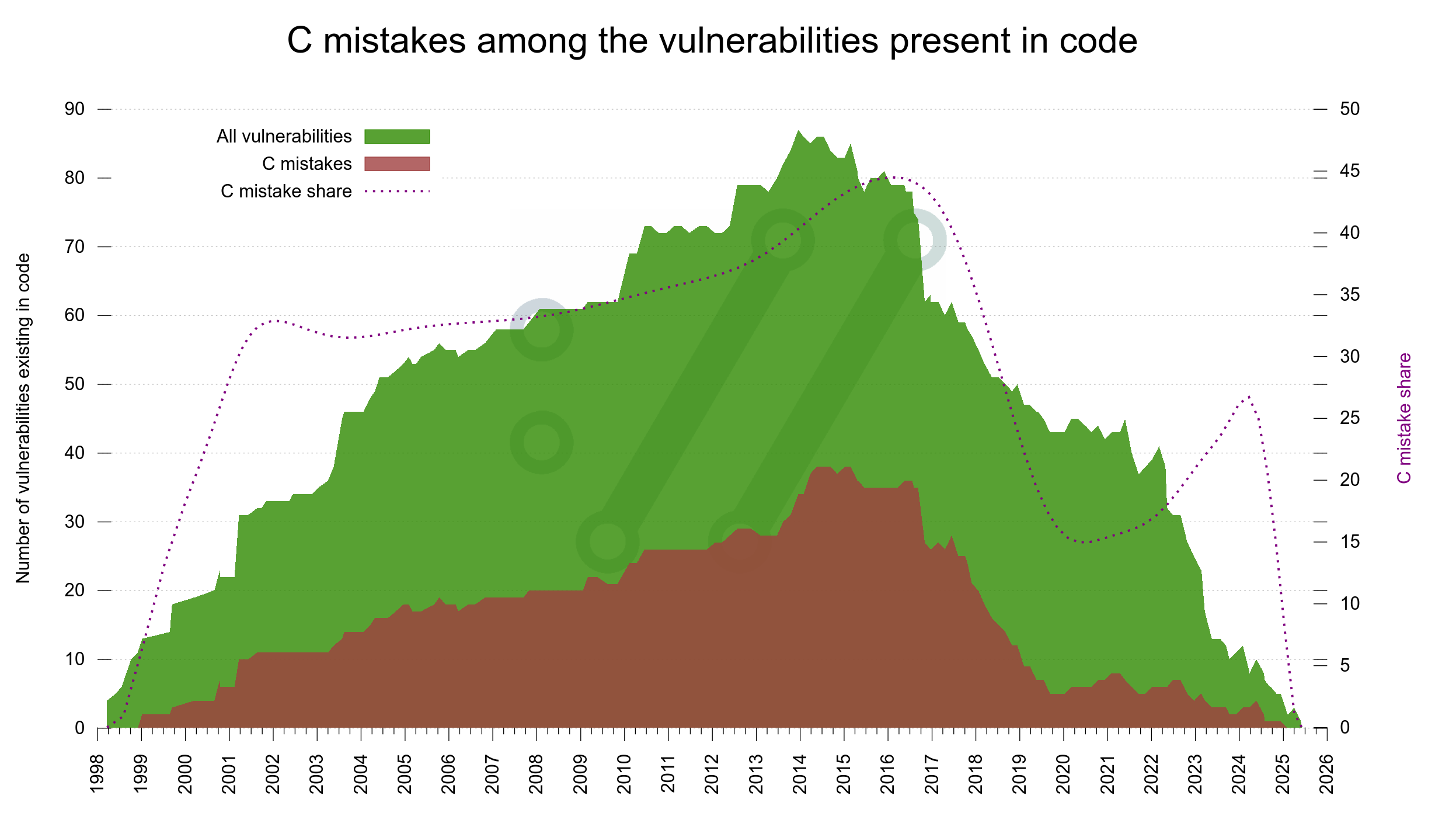
The dotted line shows the share of the total that is C mistakes, and the Y axis for that is on the right side.
Again, since it takes six years to get half of the reports, we must take at least the rightmost side of the graph as temporary as it will be changed going forward.
The trend looks like we are reducing the share of C bugs though. I don’t think there is anything that suggests that such bugs would be harder to detect than others (quite the opposite actually) so even if we know the graph will change, we can probably say with some certainty that the C mistake rate has indeed been reduced the last six seven years? (See also writing C for curl on how we work consciously on this.)
Do we improve?
I think (hope?) we are, even if the graphs are still not reliably showing this. We can come back here in 2030 or so and verify. It would be annoying if we weren’t.
We do much more testing than ever: more test cases, more CI jobs with more build combinations, using more and better analyzer tools. Combined with concerned efforts to make us write better code that helps us reduce mistakes.
That was an interesting read, thank you.
A small typo: you have “we analyze every flaw and asses”, and I believe “assess” was meant instead of “asses”.
@Alan: hehe, thanks!