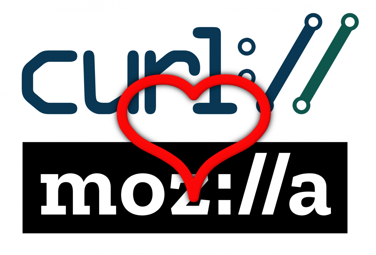
 Today Mozilla revealed the new logo and “refreshed identity”. The new Mozilla logo uses the colon-slash-slash sequence already featured in curl’s logo as I’ve discussed previously here from back before the final decision (or layout) was complete.
The sentiment remains though. We don’t feel that we can in any way claim exclusivity to this symbol of internet protocols – on the contrary we believe this character sequence tells something and we’re nothing but happy that this belief is shared by such a great organization such as Mozilla.
Will the “://” in either logo make some users think of the other logo? Not totally unlikely, but I don’t consider that bad. curl and Mozilla share a lot of values and practices; open source, pro users, primarily client-side. I am leading the curl project and I am employed by Mozilla. Also, when talking and comparing brands and their recognition and importance in a global sense, curl is of course nothing next to Mozilla.
I’ve talked to the core team involved in the Mozilla logo revamping before this was all made public and I assured them that we’re nothing but thrilled.

While I love curl and rely on it every day for my work, I had no idea it had (or needed) a logo. TIL!
Without a logo, what would we put on the tshirts and stickers? 🙂
I love people who work in software. The development community really understands the value of sharing. Makes me proud to be in this profession.