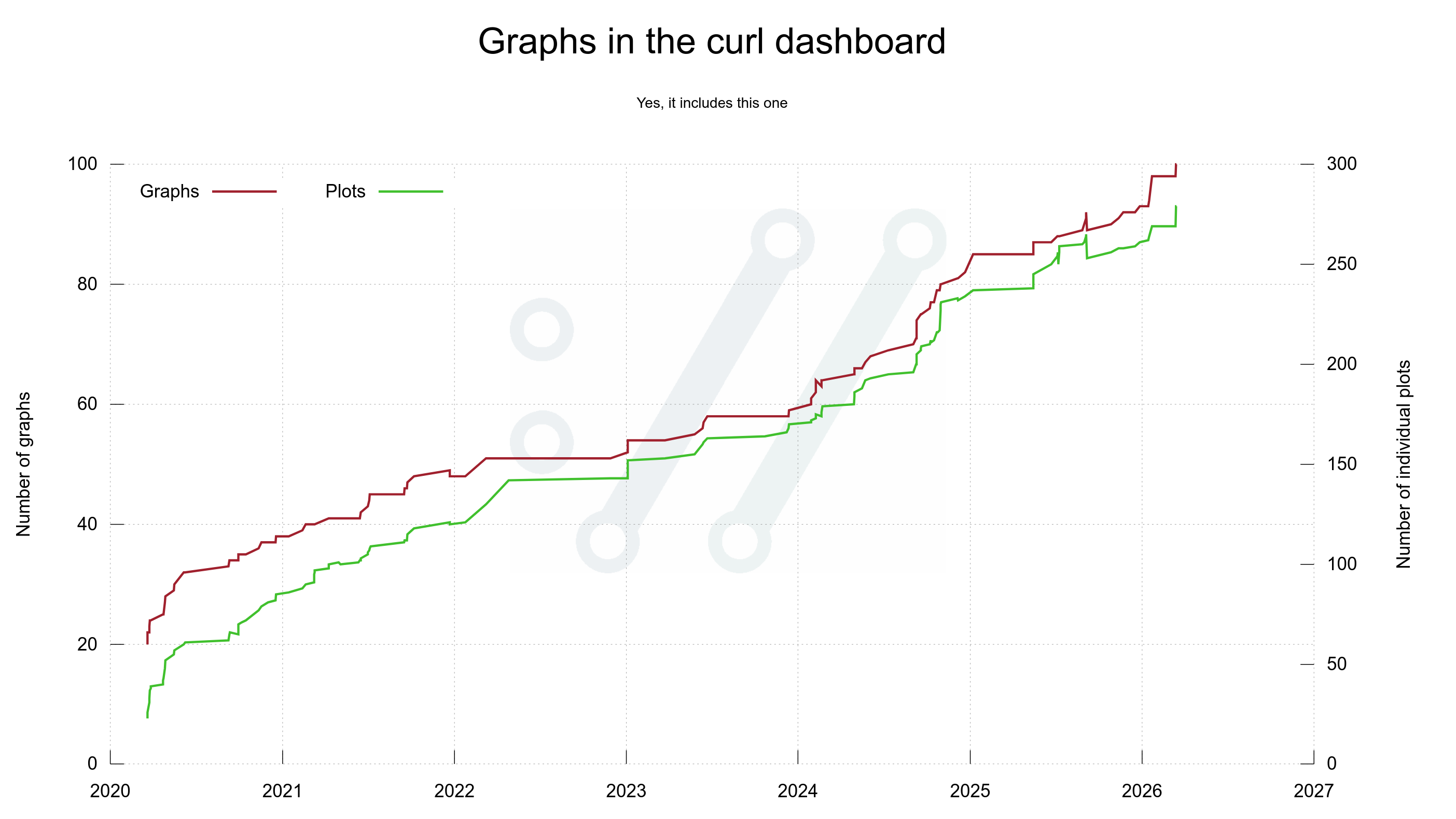
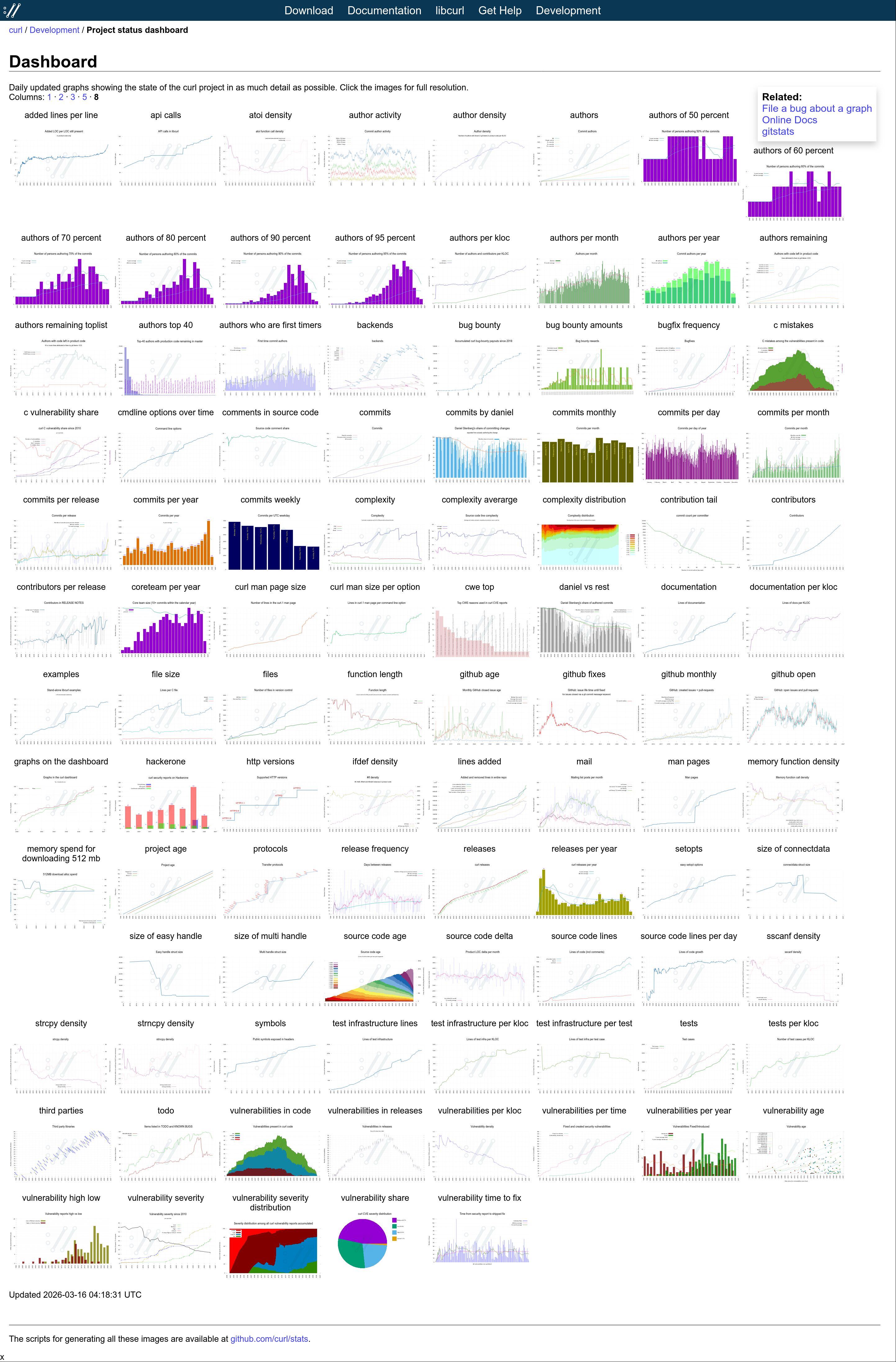
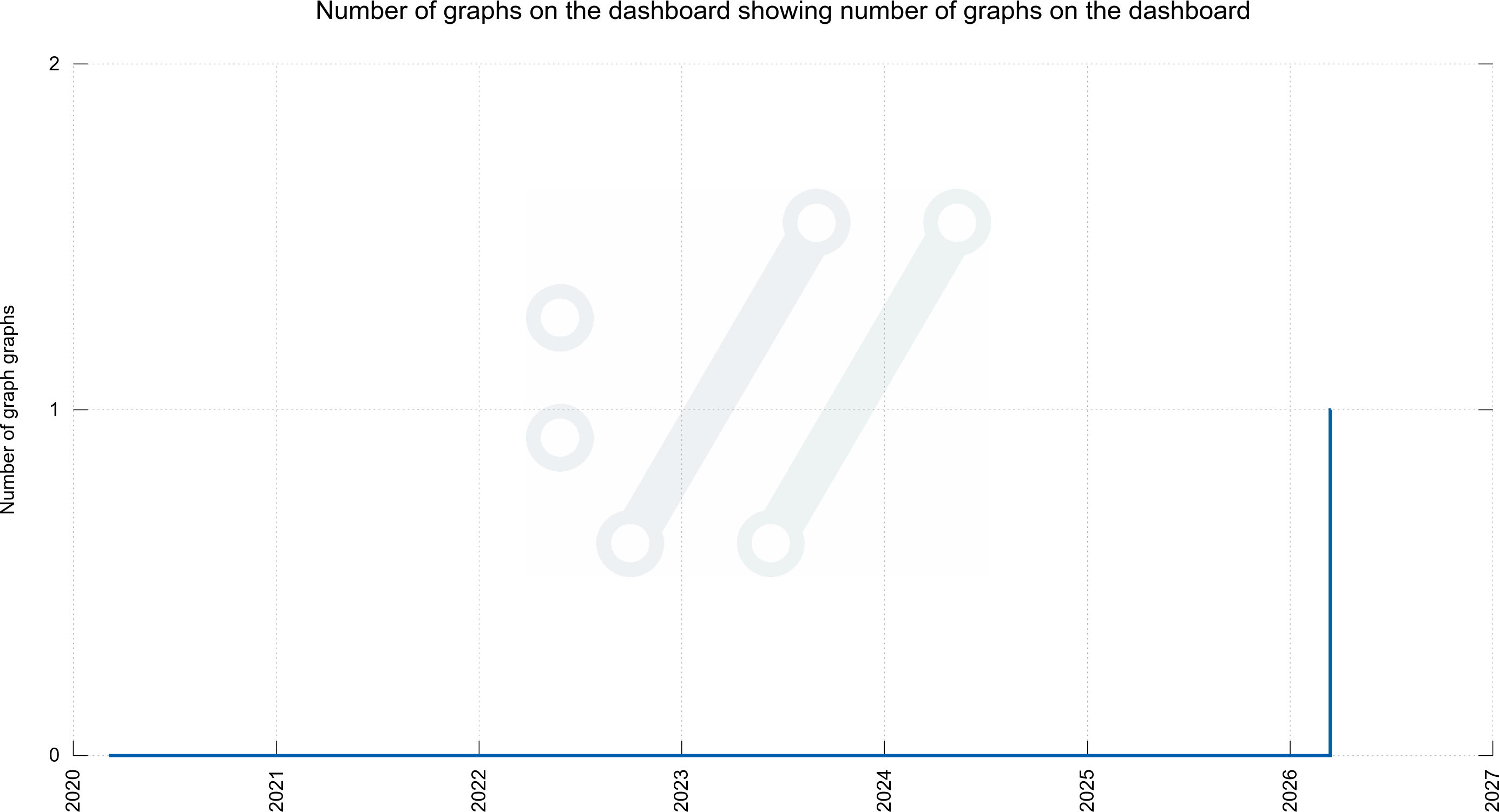
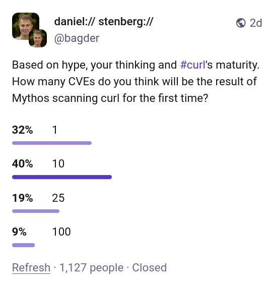
yes, as in singular one.
Back in April 2026 Anthropic caused a lot of media noise when they concluded that their new AI model Mythos is dangerously good at finding security flaws in source code. Apparently Mythos was so good at this that Anthropic would not release this model to the public yet but instead trickle it out to a selected few companies for a while to allow a few good ones(?) to get a head start and fix the most pressing problems first, before the general populace would get their hands on it.
The whole world seemed to lose its marbles. Is this the end of the world as we know it? An amazingly successful marketing stunt for sure.
My (non-) access
Part of the deal with project Glasswing was that Anthropic also offered access to their latest AI model to “Open Source projects” via Linux Foundation. Linux Foundation let their project Alpha Omega handle this part, and I was contacted by their representatives. As lead developer of curl I was offered access to the magic model and I graciously accepted the offer. Sure, I’d like to see what it can find in curl.
I signed the contract for getting access, but then nothing happened. Weeks went past and I was told there was a hiccup somewhere and access was delayed.
Eventually, I was instead offered that someone else, who has access to the model, could run a scan and analysis on curl for me using Mythos and send me a report. To me, the distinction isn’t that important. It’s not that I would have a lot of time to explore lots of different prompts and doing deep dive adventures anyway. Getting the tool to generate a first proper scan and analysis would be great, whoever did it. I happily accepted this offer.
(I am purposely leaving out the identity of the individual(s) involved in getting the curl analysis done as it is not the point of this blog post.)
AI scans of curl
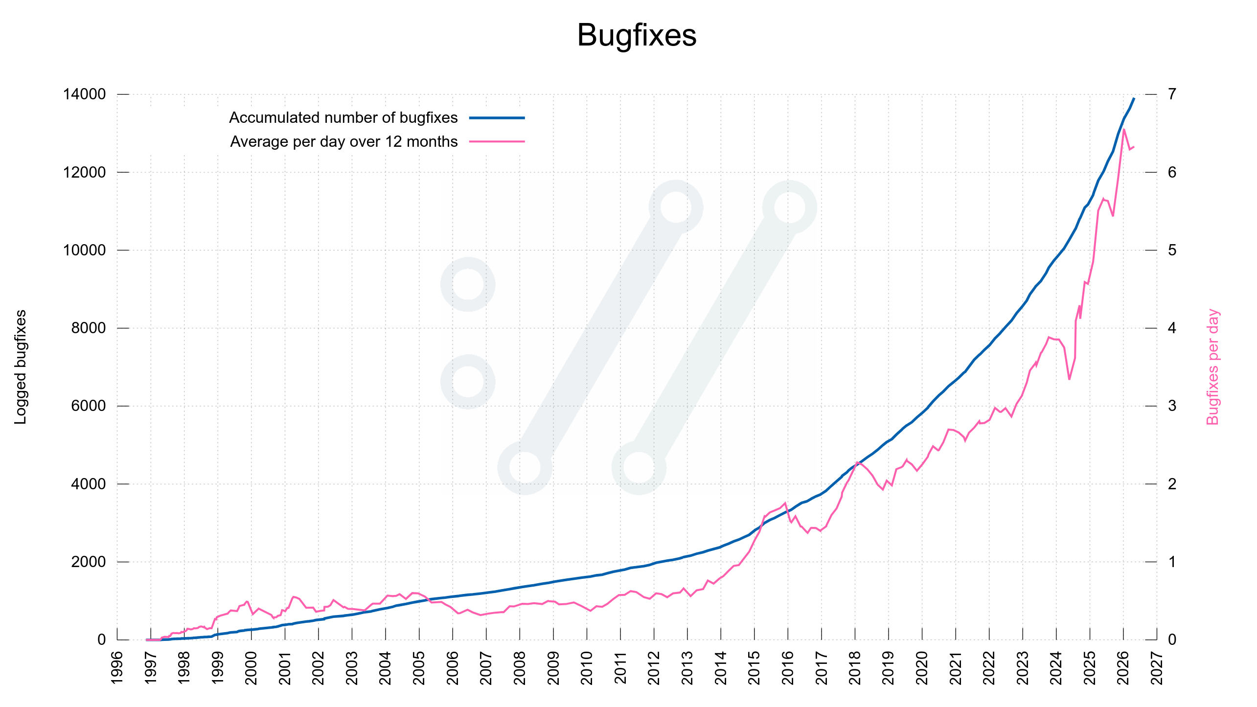
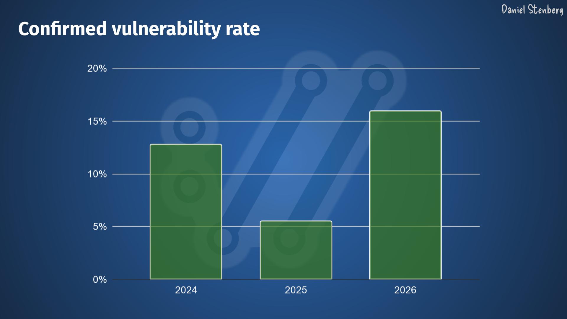
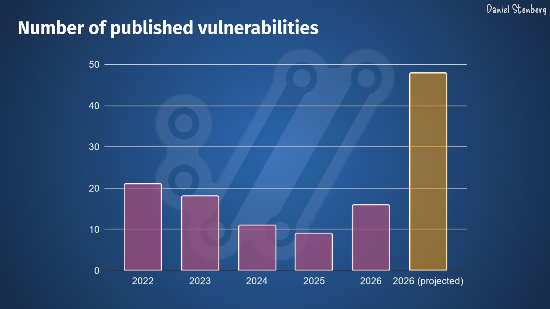
Before this first Mythos report, we had already scanned curl with several different very capable AI powered tools (I mean in addition to running a number of “normal” static code analyzers all the time, using the pickiest compiler options and doing fuzzing on it for years etc). Primarily AISLE, Zeropath and OpenAI’s Codex Security have been used to scrutinize the code with AI. These tools and the analyses they have done have triggered somewhere between two and three hundred bugfixes merged in curl through-out the recent 8-10 months or so. A bunch of the findings these AI tools reported were confirmed vulnerabilities and have been published as CVEs. Probably a dozen or more.
Nowadays we also use tools like GitHub’s Copilot and Augment code to review pull requests, and their remarks and complaints help us to land better code and avoid merging new bugs. I mean, we still merge bugs of course but the PR review bots regularly highlight issues that we fix: our merges would be worse without them. The AI reviews are used in addition to the human reviews. They help us, they don’t replace us.
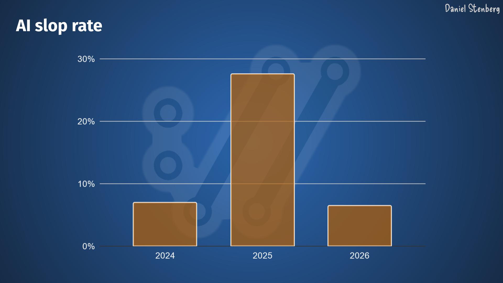
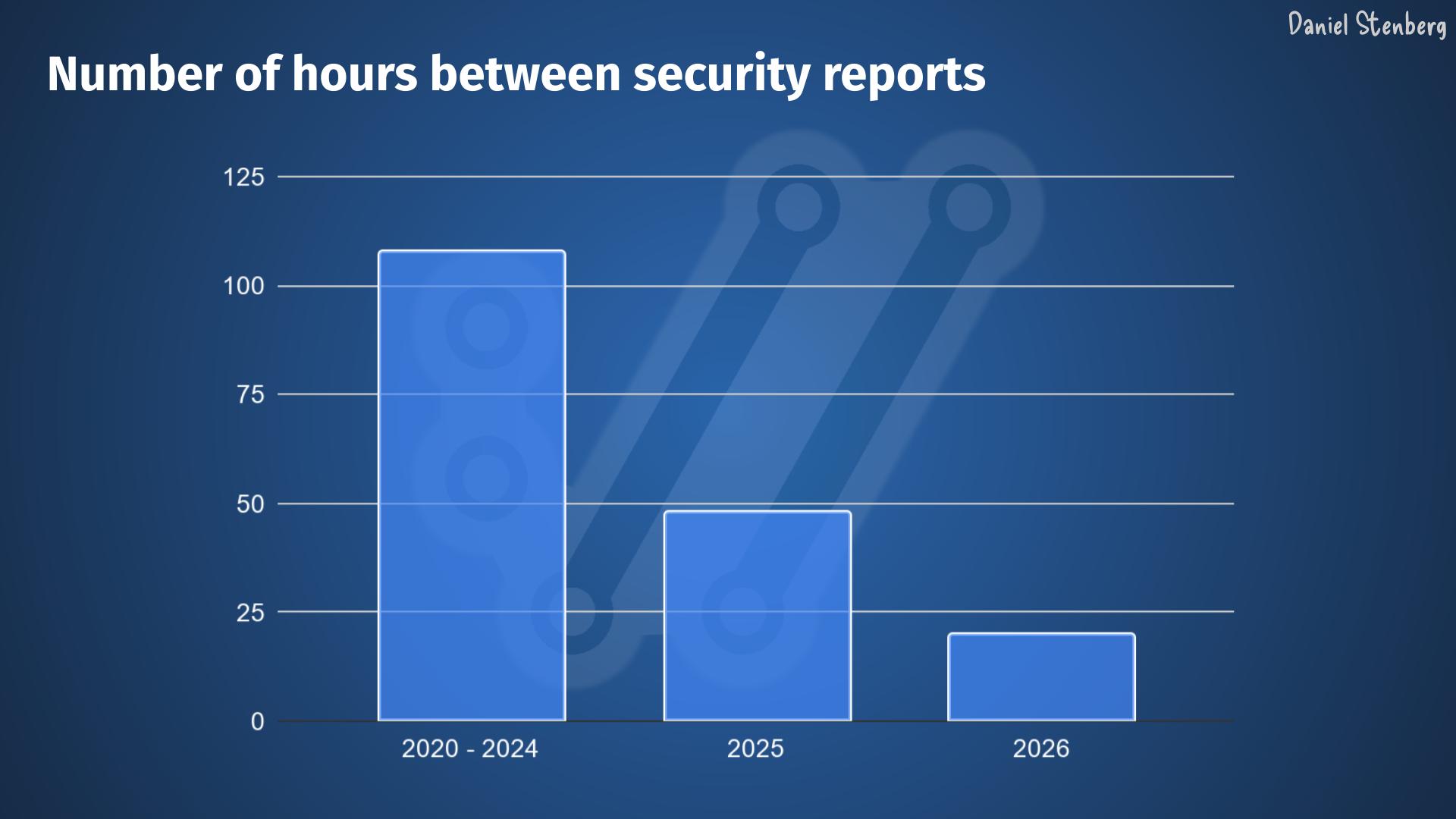
We also see a high volume of high quality security reports flooding in: security researchers now use AI extensively and effectively.
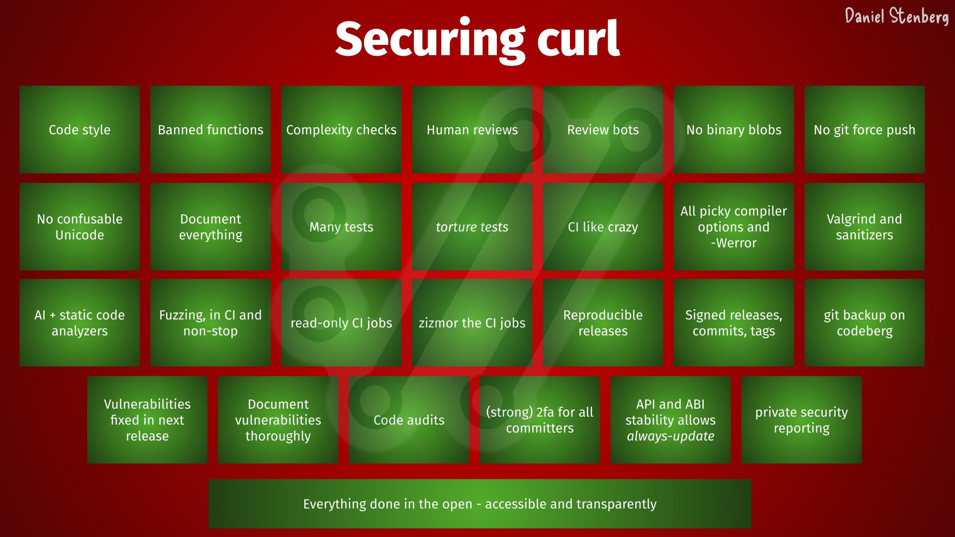
Security is a top priority for us in the curl project. We follow every guideline and we do software engineering properly, to reduce the number of flaws in code. Scanning for flaws is just one of many steps to keep this ship safe. You need to search long and hard to find another software project that makes as much or goes further than curl, for software security.
May 6, 2026
It was with great anticipation we received the first source code analysis report generated with Mythos. Another chance for us to find areas to improve and bugs to fix. To make an even better curl.
This initial scan was made on curl’s git repository and its master branch of a certain recent commit. It counted 178K lines of code analyzed in the src/ and lib/ subdirectories.
The analysis details several different approaches and methods it has performed the search, and how it has focused on trying to find which flaws. A fun note in the top of the report says:
curl is one of the most fuzzed and audited C codebases in existence (OSS-Fuzz, Coverity, CodeQL, multiple paid audits). Finding anything in the hot paths (HTTP/1, TLS, URL parsing core) is unlikely.
… and it correctly found no problems in those areas.
The size of curl
curl is currently 176,000 lines of C code when we exclude blank lines. The source code consists of 660,000 words, which is 12% more words than the entire English edition of the novel War and Peace.
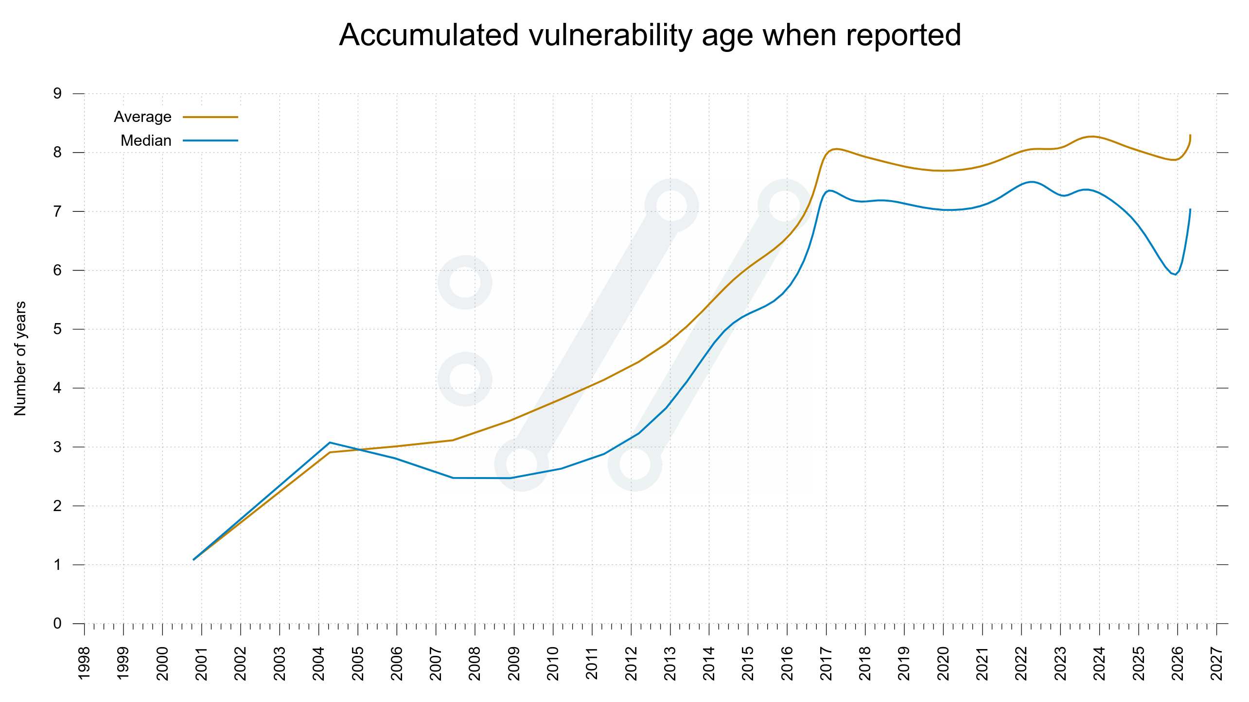
On average, every single production source code line of curl has been written (and then rewritten) 4.14 times. We have polished on this.
Right now, the existing production code in git master that still remains, has been authored by 573 separate individuals. Over time, a total of 1,465 individuals have so far had their proposed changes merged into curl’s git repository.
We have published 188 CVEs for curl up until now.
curl is installed in over twenty billion instances. It runs on over 110 operating systems and 28 CPU architectures. It runs in every smart phone, tablet, car, TV, game console and server on earth.
Five findings became one
The report concluded it found five “Confirmed security vulnerabilities”. I think using the term confirmed is a little amusing when the AI says it confidently by itself. Yes, the AI thinks they are confirmed, but the curl security team has a slightly different take.
Five issues felt like nothing as we had expected an extensive list. Once my curl security team fellows and I had poked on the this short list for a number of hours and dug into the details, we had trimmed the list down and were left with one confirmed vulnerability. The other four were three false positives (they highlighted shortcomings that are documented in API documentation) and the fourth we deemed “just a bug”.
The single confirmed vulnerability is going to end up a severity low CVE planned to get published in sync with our pending next curl release 8.21.0 in late June. The flaw is not going to make anyone grasp for breath. All details of that vulnerability will of course not get public before then, so you need to hold out for details on that.
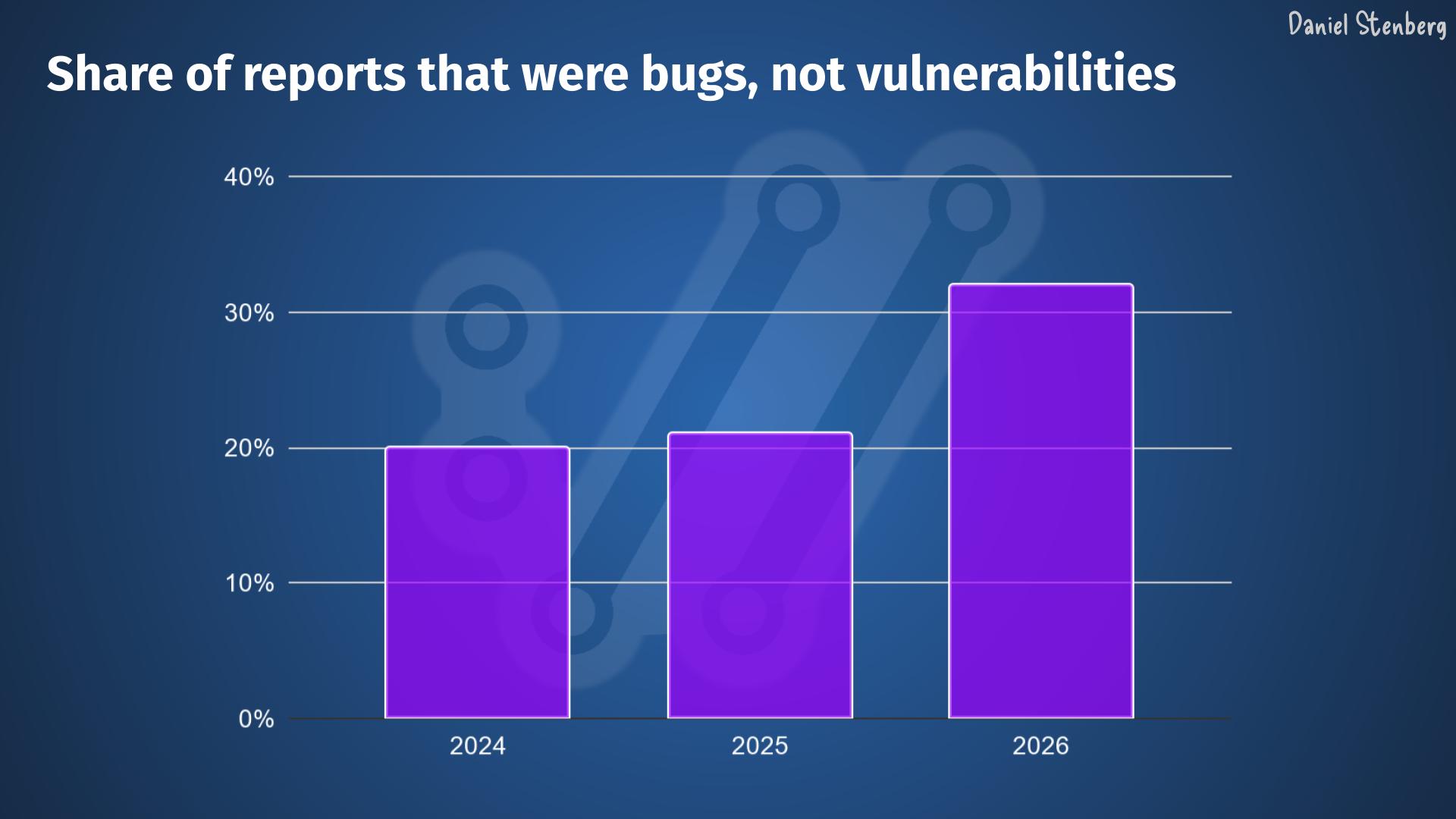
The Mythos report on curl also contained a number of spotted bugs that it concluded were not vulnerabilities, much like any new code analyzer does when you run it on hundreds of thousands of lines of code. All the bugs in the report are being investigated and one by one we are fixing those that we agree with.
All in all about twenty bugs that are described and explained very nicely. Barely any false positives, so I presume they have had a rather high threshold for certainty.
curl is certainly getting better thanks to this report, but counted by the volume of issues found, all the previous AI tools we have used have resulted in larger bugfix amounts. This is only natural of course since the first tools we ran had many more and easier bugs to find. As we have fixed issues along the way, finding new ones are slowly becoming harder. Additionally, a bug can be small or big so it’s not always fair to just compare numbers
Not particularly “dangerous”
My personal conclusion can however not end up with anything else than that the big hype around this model so far was primarily marketing. I see no evidence that this setup finds issues to any particular higher or more advanced degree than the other tools have done before Mythos. Maybe this model is a little bit better, but even if it is, it is not better to a degree that seems to make a significant dent in code analyzing.
This is just one source code repository and maybe it is much better on other things. I can only tell and comment on what it found here.
Still very good
But allow me to highlight and reiterate what I have said before: AI powered code analyzers are significantly better at finding security flaws and mistakes in source code than any traditional code analyzers did in the past. All modern AI models are good at this now. Anyone with time and some experimental spirits can find security problems now. The high quality chaos is real.
Any project that has not scanned their source code with AI powered tooling will likely find huge number of flaws, bugs and possible vulnerabilities with this new generation of tools. Mythos will, and so will many of the others.
Not using AI code analyzers in your project means that you leave adversaries and attackers time and opportunity to find and exploit the flaws you don’t find.
How AI analyzers differ
- They can spot when the comment says something about the code and then conclude that the code does not work as the comment says.
- It can check code for platforms and configurations we otherwise cannot run analyzers for
- It “knows” details about 3rd party libraries and their APIs so it can detect abuse or bad assumptions.
- It “knows” details about protocols curl implements and can question details in the code that seem to violate or contradict protocol specifications
- They are typically good at summarizing and explaining the flaw, something which can be rather tedious and difficult with old style analyzers.
- They can often generate and offer a patch for its found issue (even if the patch usually is not a 100% fix).
More details from the report
Zero memory-safety vulnerabilities found.
Methodology note: this review is hand-driven analysis using LLM subagents for parallel file reads, with every candidate finding re-verified by direct source inspection in the main session before being recorded. The CVE to variant-hunt mapping was built from curl’s own vuln.json. No automated SAST tooling was used.
This outcome is consistent with curl’s status as one of the most heavily fuzzed and audited C codebases. The defensive infrastructure (capped dynbufs everywhere, curlx_str_number with explicit max on every numeric parse, curlx_memdup0 overflow guard, CURL_PRINTF format-string enforcement, per-protocol response-size caps, pingpong 64KB line cap) systematically closes the bug classes that would normally be productive in a codebase this size.
Coverage now includes: all minor protocols, all file parsers, all TLS backends’ verify paths, http/1/2/3, ftp full depth, mprintf, x509asn1, doh, all auth mechanisms, content encoding, connection reuse, session cache, CLI tool, platform-specific code, and CI/build supply chain.
AI finds existing kinds of errors
It should be noted that the AI tools find the usual and established kind of errors we already know about. It just finds new instances of them.
We have not seen any AI so far report a vulnerability that would somehow be of a novel kind or something totally new. They do not reinvent the field in that way, but they do dig up more issues than any other tools did before.
More to find
These were absolutely not the last bugs to find or report. Just while I was writing the drafts for this blog post we have received more reports from security researchers about suspected problems. The AI tools will improve further and the researchers can find new and different ways to prompt the existing AIs to make them find more.
We have not reached the end of this yet.
I hope we can keep getting more curl scans done with Mythos and other AIs, over and over until they truly stop finding new problems.
Credits
Thanks to Anthropic and Alpha Omega for providing the model, the tools and doing the scan for us. Thanks also to the individual who did the scan for us. Much appreciated!
Top image by Jin Kim from Pixabay
Thanks for flying curl. It’s never dull.


