In the curl project we make great efforts to store a lot of meta data about each and every vulnerability that we have fixed over the years – and curl is over 23 years old. This data set includes CVE id, first vulnerable version, last vulnerable version, name, announce date, report to the project date, CWE, reward amount, code area and “C mistake kind”.
We also keep detailed data about releases, making it easy to look up for example release dates for specific versions.
Dashboard
All this, combined with my fascination (some would call it obsession) of graphs is what pushed me into creating the curl project dashboard, with an ever-growing number of daily updated graphs showing various data about the curl projects in visual ways. (All scripts for that are of course also freely available.)
What to show is interesting but of course it is sometimes even more important how to show particular data. I don’t want the graphs just to show off the project. I want the graphs to help us view the data and make it possible for us to draw conclusions based on what the data tells us.
Vulnerabilities
The worst bugs possible in a project are the ones that are found to be security vulnerabilities. Those are the kind we want to work really hard to never introduce – but we basically cannot reach that point. This special status makes us focus a lot on these particular flaws and we of course treat them special.
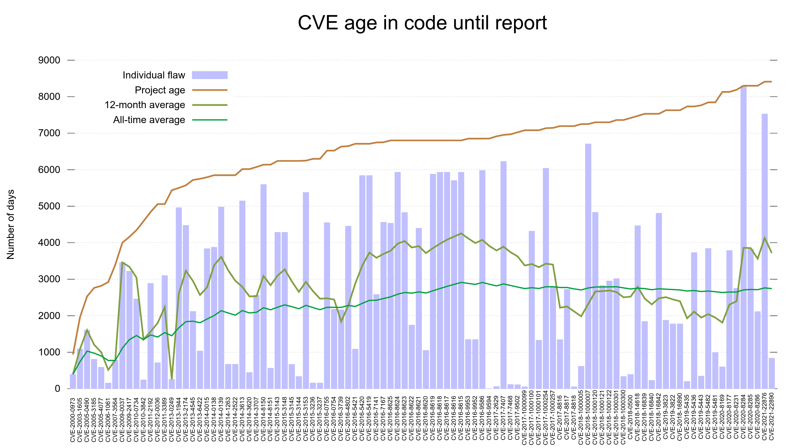
For a while we’ve had two particular vulnerability graphs in the dashboard. One showed the number of fixed issues over time and another one showed how long each reported vulnerability had existed in released source code until a fix for it shipped.
CVE age in code until report
The CVE age in code until report graph shows that in general, reported vulnerabilities were introduced into the code base many years before they are found and fixed. In fact, the all time average time suggests they are present for more than 2,700 – more than seven years. Looking at the reports from the last 12 months, the average is even almost 1000 days more!
It takes a very long time for vulnerabilities to get found and reported.

When were the vulnerabilities introduced
Just the other day it struck me that even though I had a lot of graphs already showing in the dashboard, there was none that actually showed me in any nice way at what dates we created the vulnerabilities we spent so much time and effort hunting down, documenting and talking about.
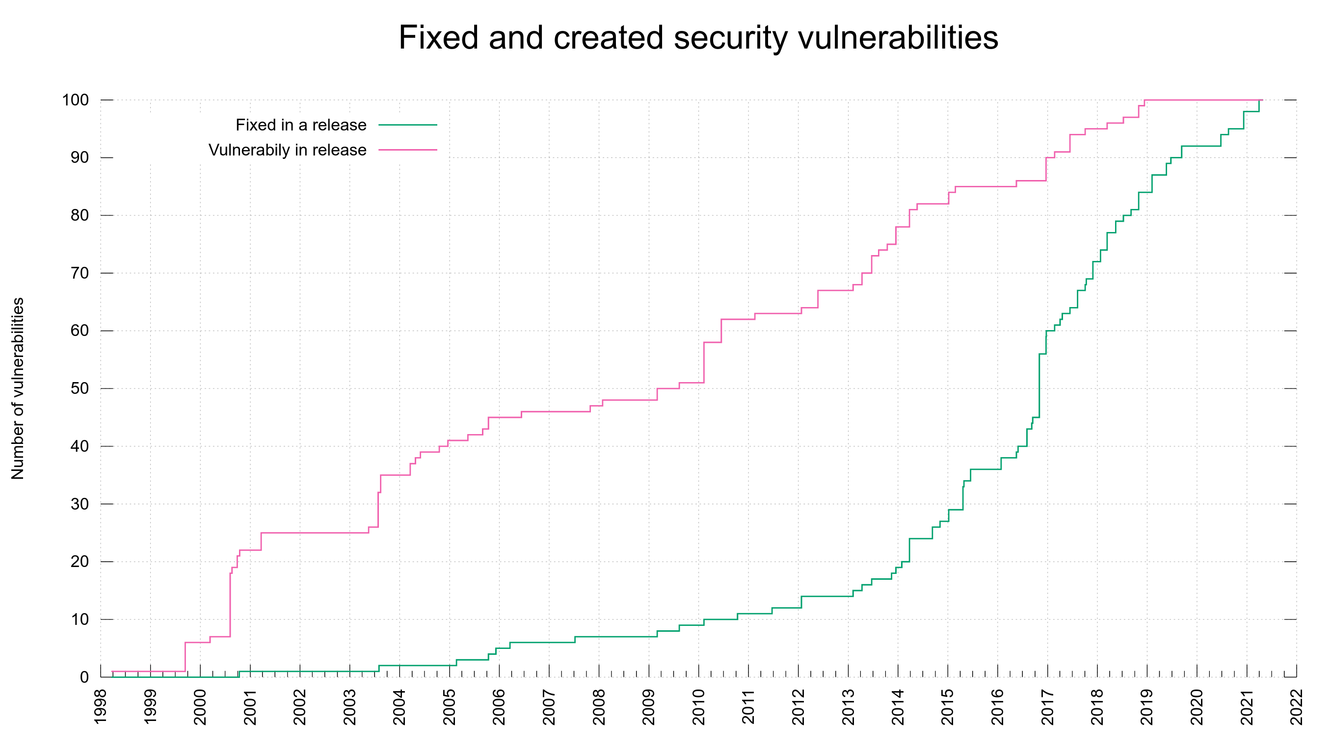
I decided to use the meta data we already have and add a second plot line to the already existing graph. Now we have the previous line (shown in green) that shows the number of fixed vulnerabilities bumped at the date when a fix was released.
Added is the new line (in red) that instead is bumped for every date we know a vulnerability was first shipped in a release. We know the version number from the vulnerability meta data, we know the release date of that version from the release meta data.
This all new graph helps us see that out of the current 100 reported vulnerabilities, half of them were introduced into the code before 2010.
Using this graph it also very clear to me that the increased CVE reporting that we can spot in the green line started to accelerate in the project in 2016 was not because the bugs were introduced then. The creation of vulnerabilities rather seem to be fairly evenly distributed over time – with occasional bumps but I think that’s more related to those being particular releases that introduced a larger amount of features and code.
As the average vulnerability takes 2700 days to get reported, it could indicate that flaws landed since 2014 are too young to have gotten reported yet. Or it could mean that we’ve improved over time so that new code is better than old and thus when we find flaws, they’re more likely to be in old code paths… I don’t think the red graph suggests any particular notable improvement over time though. Possibly it does if we take into account the massive code growth we’ve also had over this time.
The green “fixed” line at least has a much better trend and growth angle.

Present in which releases
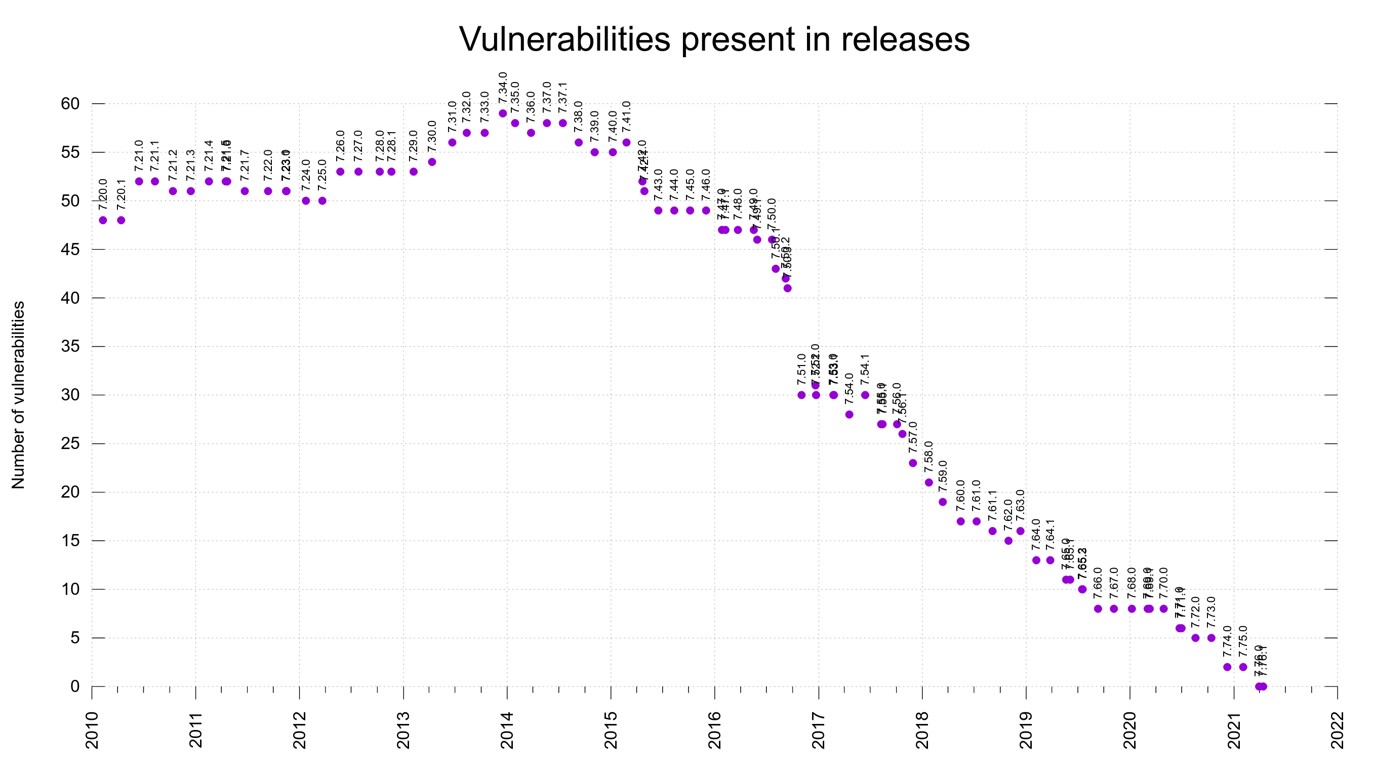
As we have the range of vulnerable releases stored in the meta data file for each CVE, we can then add up the number of the flaws that are present in every past release.
Together with the release dates of the versions, we can make a graph that shows the number of reported vulnerabilities that are present in each past release over time, in a graph.
You can see that some labels end up overwriting each other somewhat for the occasions when we’ve done two releases very close in time.


Experiencing a fault requires a mistake in the code and somebody to execute the code with the ‘right’ input.
So faults are generated by users 🙂
I’m guessing that the greater the number of lines of code that needs to be changed to fix a coding mistake, the more likely it is to be executed.
Is any information available on the files/functions/lines that need to be modified to fix a reported fault?
As somebody who is interested in graph you will probably enjoy my book Evidence-based Software Engineering pdf+code+all data freely available here: http://knosof.co.uk/ESEUR/
Derek: for every security advisory we have released in the project, there’s a corresponding fix/patch. That patch of course changes one or more source files. There are no secrets, everything is there to read. It might just take a little manual work to extract the info if you want it for all flaws.