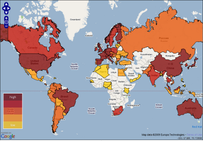
So Redhat created and made this very interesting Open Source Activity Map available. It rates 75 countries’ open sourceness based on “Government, Industry, and Community” and how good the countries are at open source. Sort of. The numbers are based on research done by Georgia Institute of Technology.
What does it give?
I’m a Swede who lives in Sweden and I can see that we’re not generally that much into open source, but we’re also a very small population compared to lots of other countries. But no, I cannot see how Finland or Norway are any further than we. What also puzzles me is how they even rate China before Sweden. The numbers that are provided don’t appear to take population into account, or even participation level in open source projects.
Of course I realize I have but one view and my view is deeply skewed by the projects I work in and by the people I meet and I have never even tried to compare different countries’ governments against each other in regards of open source so I figure I can’t make a good comment on these results. What is weird is that there’s simply almost no participants in open source projects from China (and several other Asian countries) and I’ve always thought that’s primarily due to language barriers. Is this map then suggesting that those missing people make up for it in projects within their own language regions?
Or isn’t it so that this map is more a map of comparing legislations and governments against each other, and no so much what actual people from these countries do in various projects? I would otherwise assume that us people in the western world have a small benefit from being close to the English language. Not to mention how those speaking native English can easily jump into most projects without thinking twice about language problems.
I think however that this is a very good idea. It brings issues to the open. What makes a country good for open source? What’s needed to make my country better?

