(I wrote about this topic in my weekly email this week. This is the blog version, somewhat extended.)
Easy to read
Two contributing factors that make code hard to read are function length and function complexity. To keep source code easy to read, understand and debug we should strive towards keeping functions short and simple. Nothing ground-breaking in that conclusion.
I know, it sounds really simple and straight forward but in a living project that goes on for decades, code develops, moves and grows over time. What started out small and simple risk gradually turning into something else.
This of course because there are so many more factors involved that need to be given focus as well. Like security, bugfixes, performance, food on the table and getting more people involved.
Graphs graphs graphs
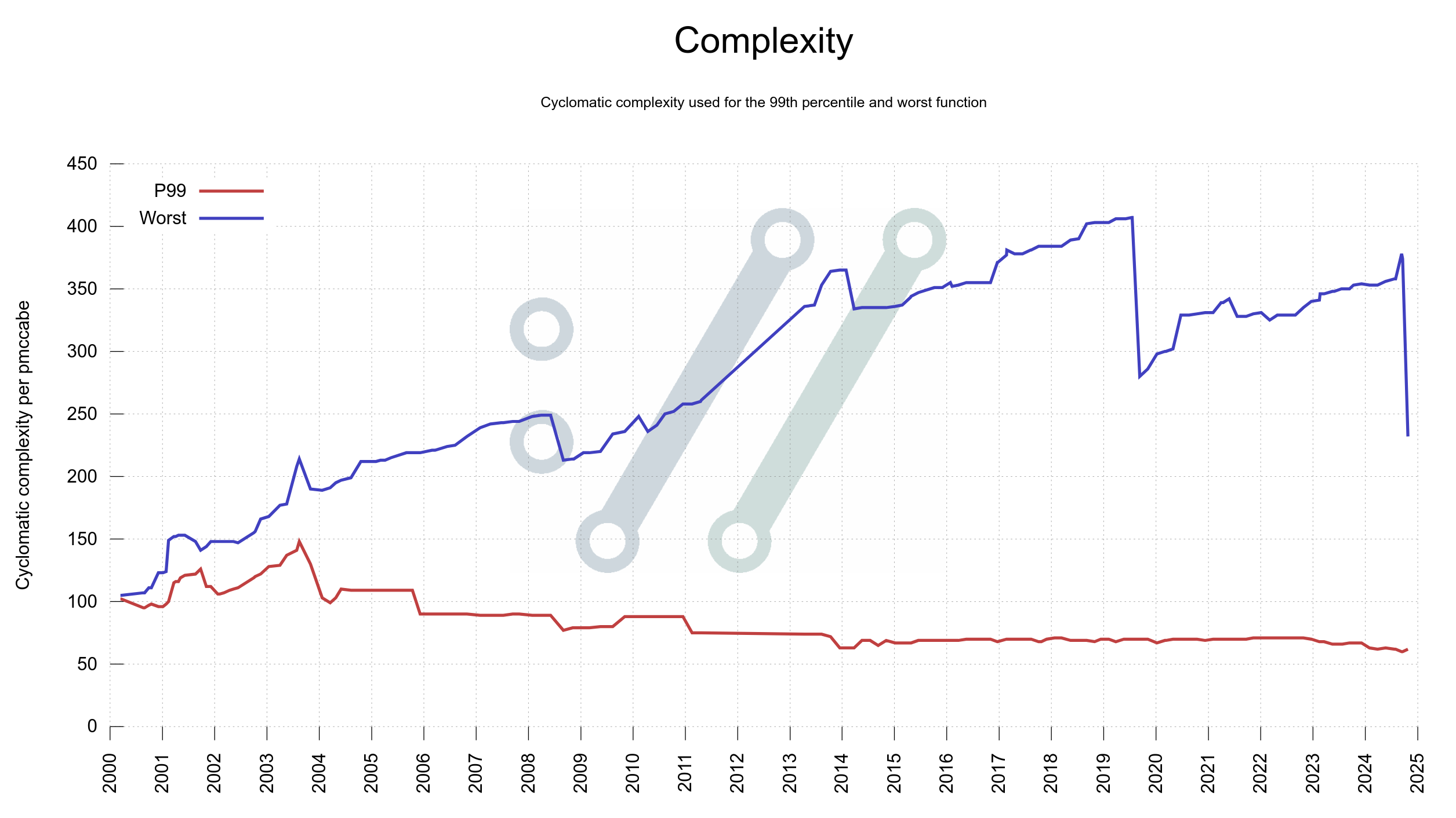
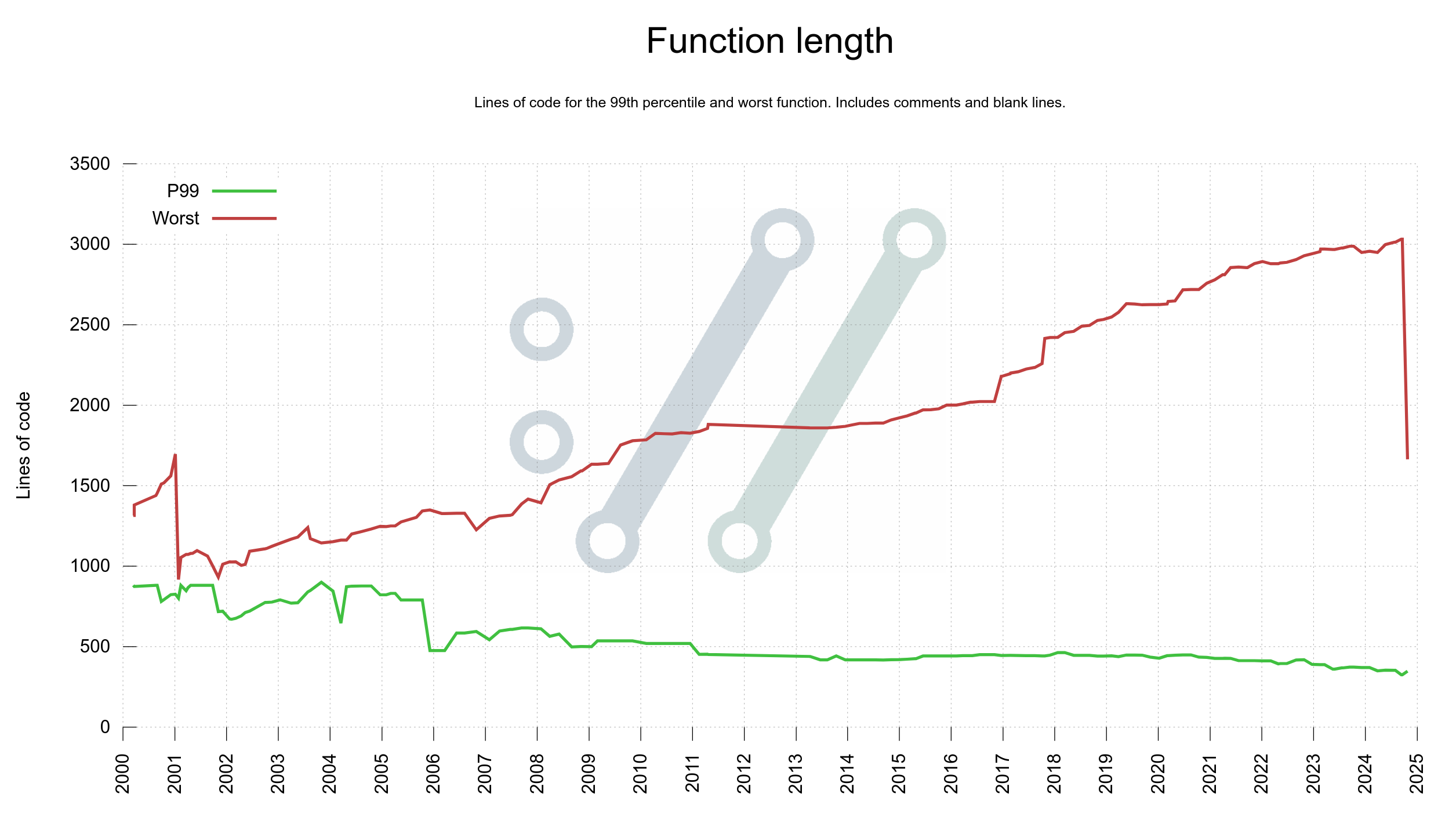
Last week I added two more graphs to the curl dashboard showing function complexity and function length growth in curl code over the decades: one plot for the worst function and one plot for the 99th percentile in each graph. For both graphs, the 99th percentile plots shrink gradually over time but the worst offenders grow. This means that there are a few functions that with attention could improve readability and code maintainability but that in general things are under control.
One of the main points for me with graphing the project from as many angles as possible is to unveil things like this. Areas that might need attention, and then keep a check on these areas going forward. Details like these are otherwise rather subtle and not easily detected when manually browsing around.
It has been said that whatever measurement you use to track engineering progress, that will then become the goal for what engineers work towards. I hope to combat this by measuring (and graphing) as many angles as possible of the curl project. To help push us in the right direction in as many different areas as possible.
Improve
I took it upon myself to improve the situation: to reduce the size of the largest function in the code base and to simplify the most complex one. Incidentally they were different functions: the largest function was the big switch handling curl_easy_setopt options, and the most complex one was the main curl tool function setting up a single transfer.
These two functions had simply just slowly and consistently been growing over time, in size and complexity. No one’s “fault” really and not with any specific plan or intention. The graph helped me decide to act and the pmccabe tool helped me identify them. We can of course argue about the specific method or number that pmccabe presents for complexity, but I think it at least is pretty good at actually identifying the correct functions and the exact particular score it sets is not terribly important.
Both pull-requests became > 2000 modified lines monsters, but they also had immediate and distinct effects on the graphs; which ideally should mean that the code readability is now a little better than before, making the functions easier to improve and work with going forward
Complexity
The single worst function in production code had gotten quite complex. I spent a work day on the case and look at the drop on the right edge of the graph below, made after my fix landed. Most of the job was to properly split the function into several smaller ones that made sense.
The single worst offender at this particular time was the function in the curl tool that sets up a single transfer job.
There are still some pretty complex ones remaining. Room for further improvements no doubt.
Function length
The worst offenders in terms of function size in curl have been of two kinds: state machines with many states and functions handling big switches for options.
In this particular case, this was the big function handling curl_easy_setopt(), and as we have over three hundred options having them all handled in a single function made it very big. The new setup splits that handling up into multiple smaller functions, one for each kind of input.
The largest one is now at over 1,500 lines. Still on the too large side of things but way better than before.
Going forward
Yes, I am a graphaholic and I seem to keep finding new ways to illustrate project status and development using plots on timelines. I am also most likely the biggest consumer of these graphs as I monitor them daily to make sure I have full control of how we are in the project, in every imaginable aspect.
I intend to try to continue simplifying a few more of the functions in the pmccabe toplist.
Let’s see what the graph shows in another three years.