Tag Archives: statistics

One hundred curl graphs

In the spring of 2020 I decided to finally do something about the lack of visualizations for how the curl project is performing, development wise.

How does the line of code growth look like? How many command line options have we had over time and how many people have done more than 10 commits per year over time?

I wanted to have something that visually would show me how the project is doing, from different angles, viewpoints and probes. In my mind it would be something like a complicated medical device monitoring a patient that a competent doctor could take a glance at and assess the state of the patient’s health and welfare. This patient is curl, and the doctors would be fellow developers like myself.

GitHub offers some rudimentary graphs but I found (and still find) them far too limited. We also ran gitstats on the repository so there were some basic graphs to get ideas from.

Make it myself

I did a look-around to see what existing frameworks and setups that existed that I should base this one, as I was convinced I would have to do quite some customizing myself. Nothing I saw was close enough to what I was looking for. I decided to make my own, at least for a start.

I decided to generate static images for this, not add some JavaScript framework that I don’t know how to use to the website. Static daily images are excellent for both load speed and CDN caching. As we already deny running JavaScript on the site that saved me from having to work against that. SVG images are still vector based and should scale nicely.

SVG is also a better format from a download size perspective, as PNG almost always generate much larger images for this kind of images.

When this started, I imagined that it would be a small number of graphs mostly showing timelines with plots growing from lower left to upper right. It would turn out to be a little naive.

gnuplot

I knew some basics about gnuplot from before as I had seen images and graphs generated by others in the past. Since gitstats already used it I decided to just dive in deeper and use this. To learn it.

gnuplot is a 40 year old (!) command line tool that can generate advanced graphs and data visualizations. It is a powerful tool, which also means that not everything is simple to understand and use at once, but there is almost nothing in terms of graphs, plots and curves that it cannot handle in one way or another.

I happened to meet Lee Phillips online who graciously gave me a PDF version of his book aptly named gnuplot. That really helped!

Produce data to feed gnuplot

I decided that for every graph I want to generate, I first gather and format the data with one script, then render an image in a separate independent step using gnuplot. It made it easy to work on them in separate steps and also subsequently tune them individually and to make it easy to view the data behind every graph if I ever think there’s a problem in one etc.

It took me about about two weeks of on and off working in the background to get a first set of graphs visualizing curl development status.

I then created the glue scripting necessary to add a first dashboard with the existing graphs to the curl website. Static HTML showing static SVG images.

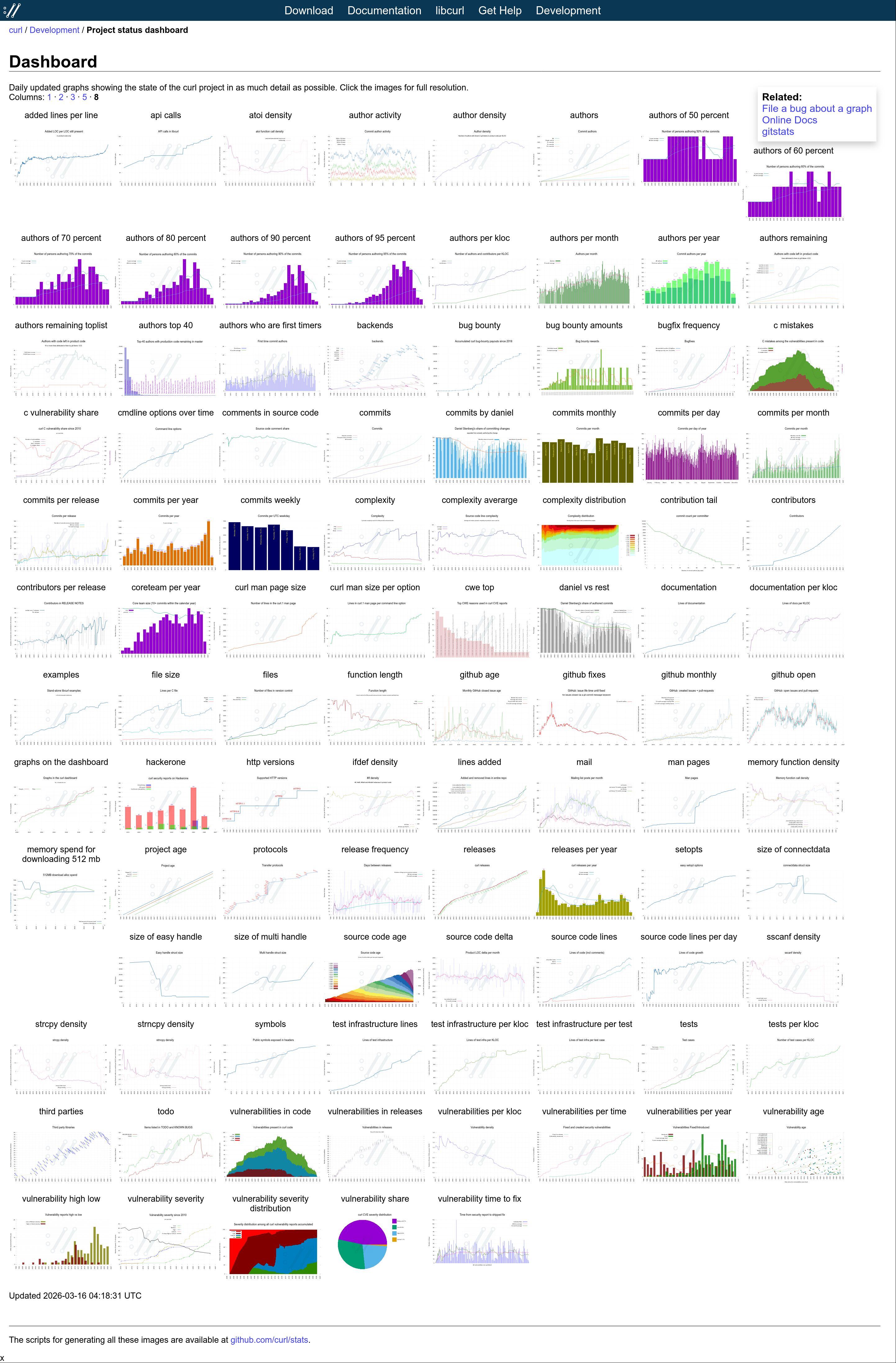
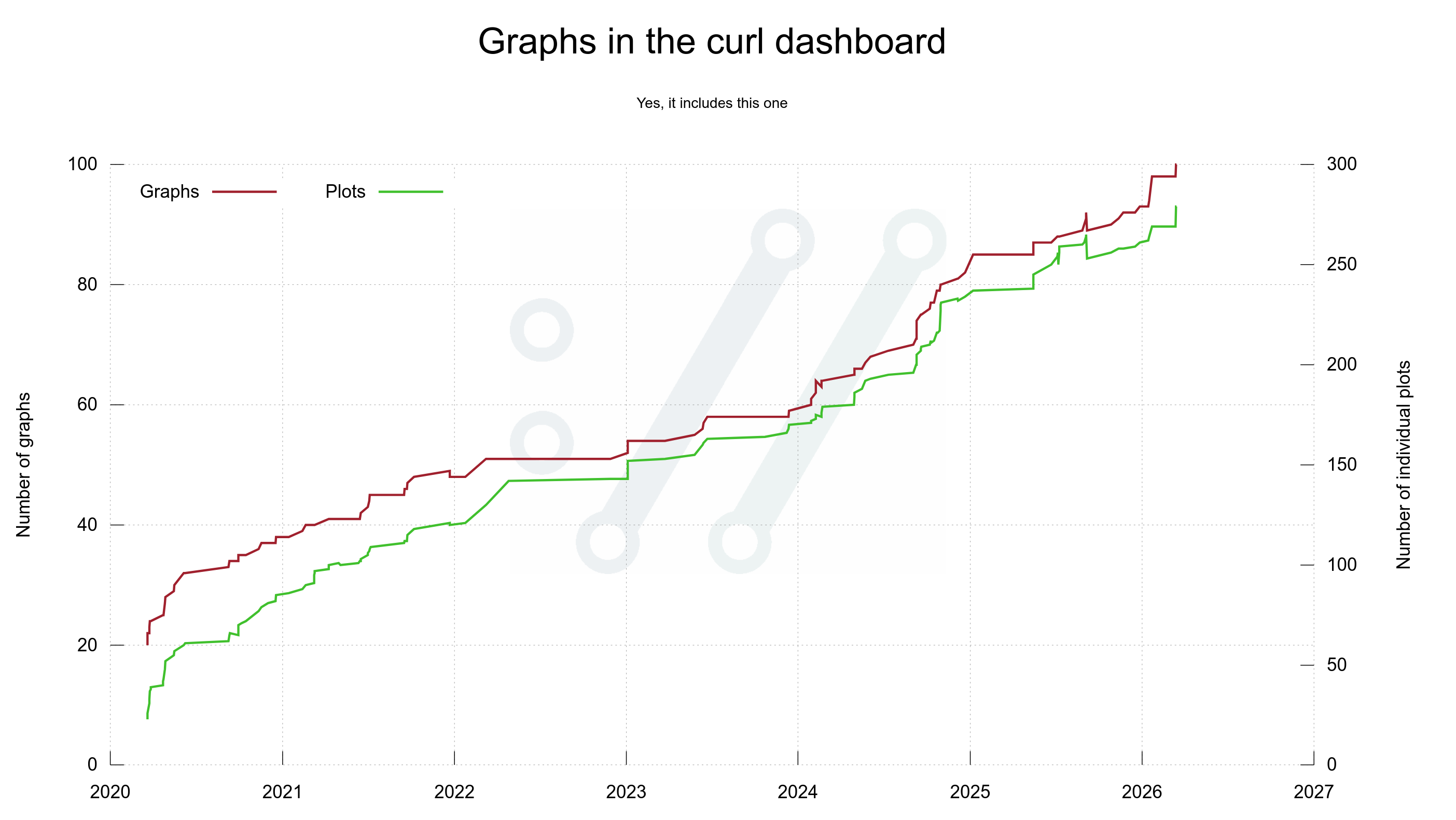
On March 20, 2020 the first version of the dashboard showed no less than twenty separate graphs. I refer to “a graph” as a separate image, possibly showing more than one plot/line/curve. That first dashboard version had twenty graphs using 23 individual plots.

Since then, we display daily updated graphs there.

The data

All data used for populating the graphs is open and available, and I happily use whatever is available:

  • git repository (source, tags, etc)
  • GitHub issues
  • mailing list archives
  • curl vulnerability data
  • hackerone reports
  • historic details from the curl past

Open and transparent as always.

Then it grew

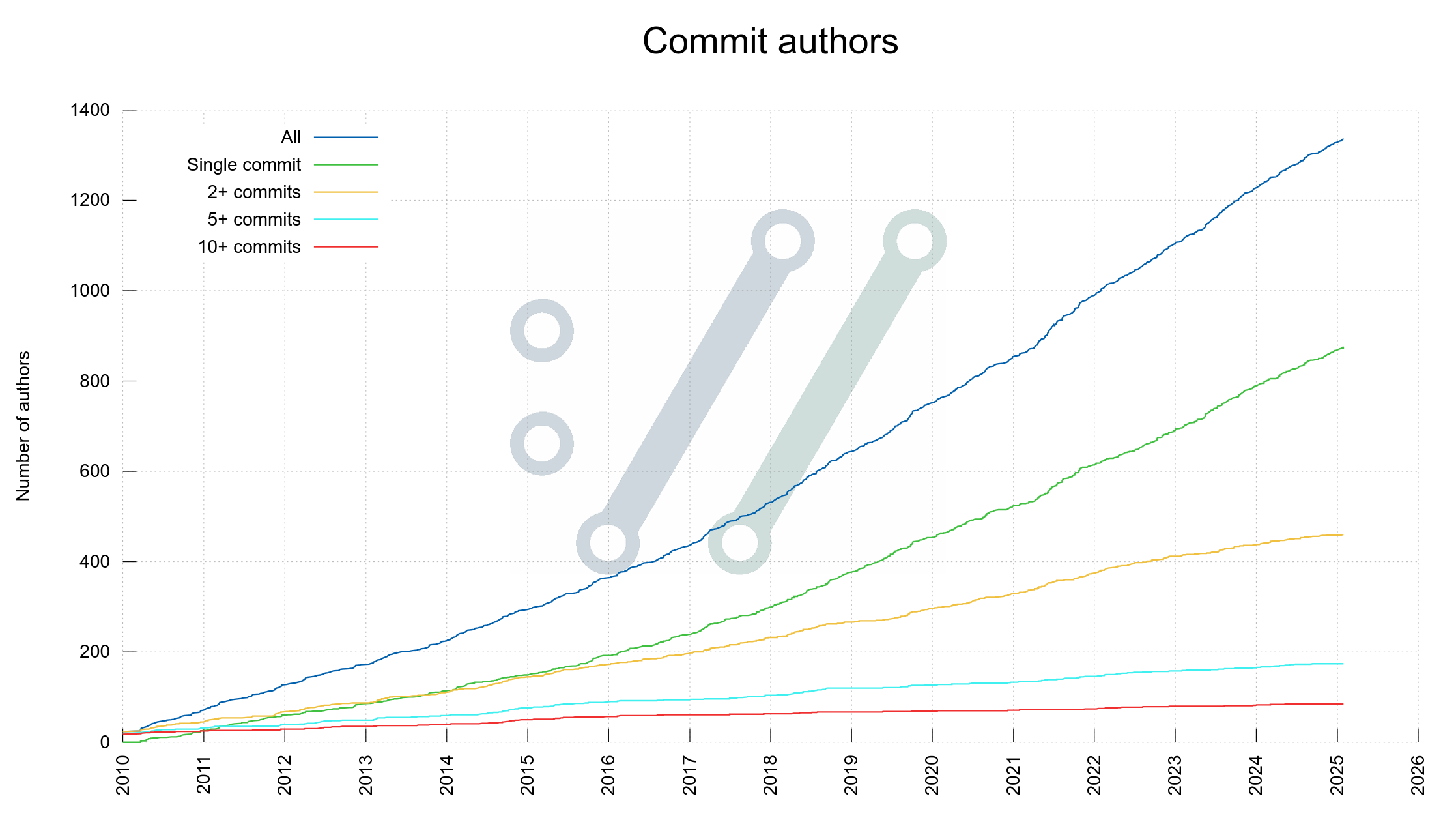
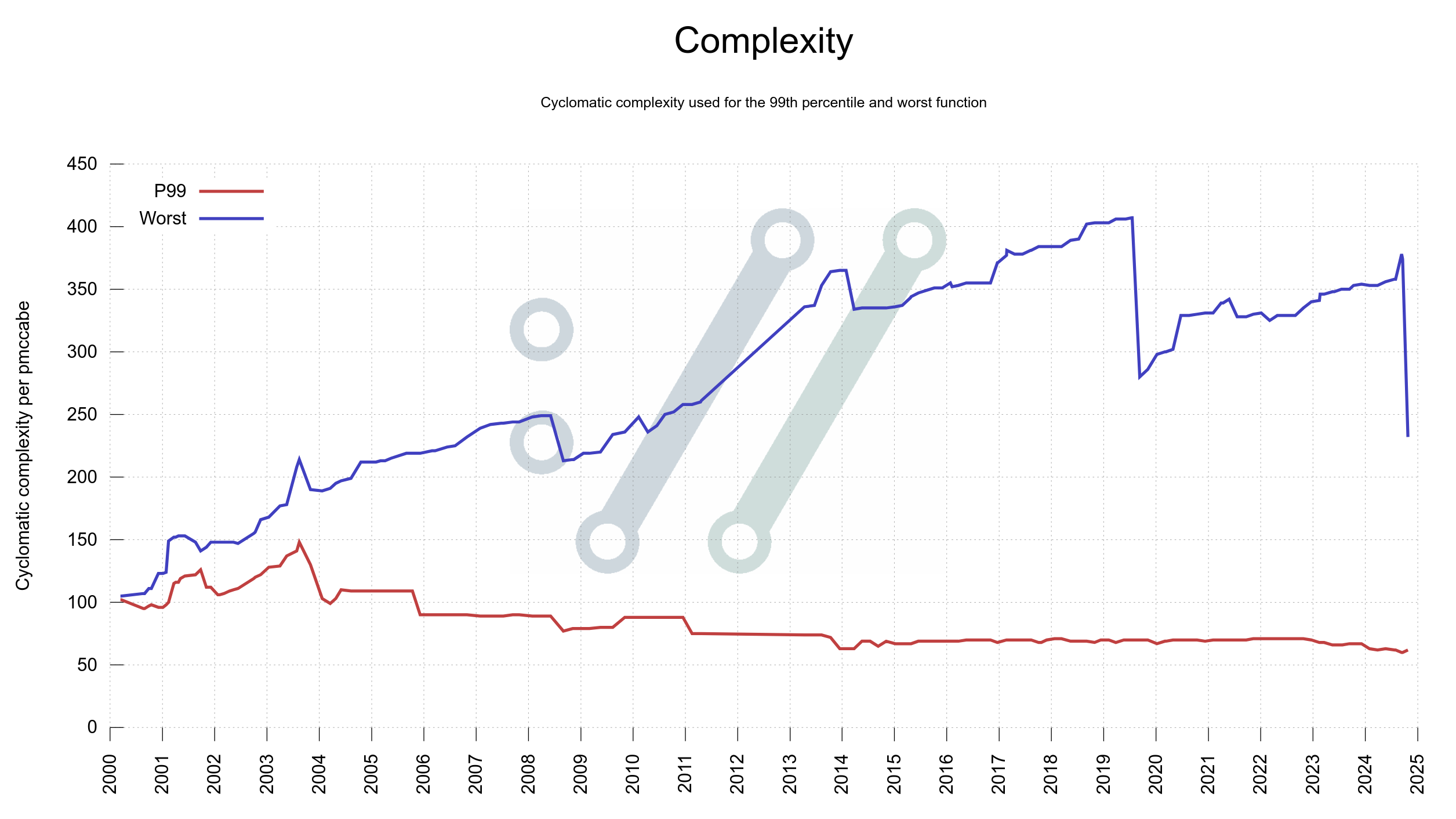
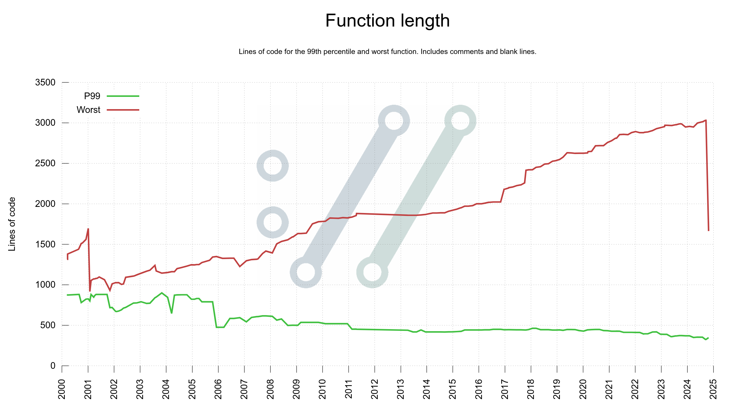
Every once in a while since then I get to think of something else in the project, the code, development, the git history, community, emails etc that could be fun or interesting to visualize and I add a graph or two more to the dashboard. Six years after its creation, the initial twenty images have grown to one hundred graphs including almost 300 individual plots.

Most of them show something relevant, while a few of them are in the more silly and fun category. It’s a mix.

Graph 100

The 100th graph was added on March 15, 2026 when I brought back the “vulnerable releases” graph (appearing on the site on March 16 for the first time). It shows the number of known vulnerabilities each past release has. I removed it previously because it became unreadable, but in this new edition I made it only show the label for every 4th release which makes it slightly less crowded than otherwise.

This day we also introduce a new 8-column display mode.

Custom but available

Many of the graphs are internal and curl specific of course. The scripts for this, and the entire dashboard, remain written specifically for curl and curl’s circumstances and data. They would need some massaging and tweaking in order to work for someone else.

All the scripts are of course open and available for everyone.

I used to also offer all the CSV files generated to render the graphs in an easy accessible form on the site, but this turned out to be work done for virtually no audience, so I removed that again. If you replace the .svg extension with .csv, you can still get most of the data – if you know.

Data is knowledge

The graphs and illustrations are not only silly and fun. They also help us see development from different angles and views, and they help us draw conclusions or at least try to. As an established and old project that makes an effort to do right, some of what we learn from this curl data might be possible to learn from and use even in other projects. Maybe even use as basis when we decide what to do next.

I personally have used these graphs in countless blog posts, Mastodon threads and public curl presentations. They help communicate curl development progress.

The jokes

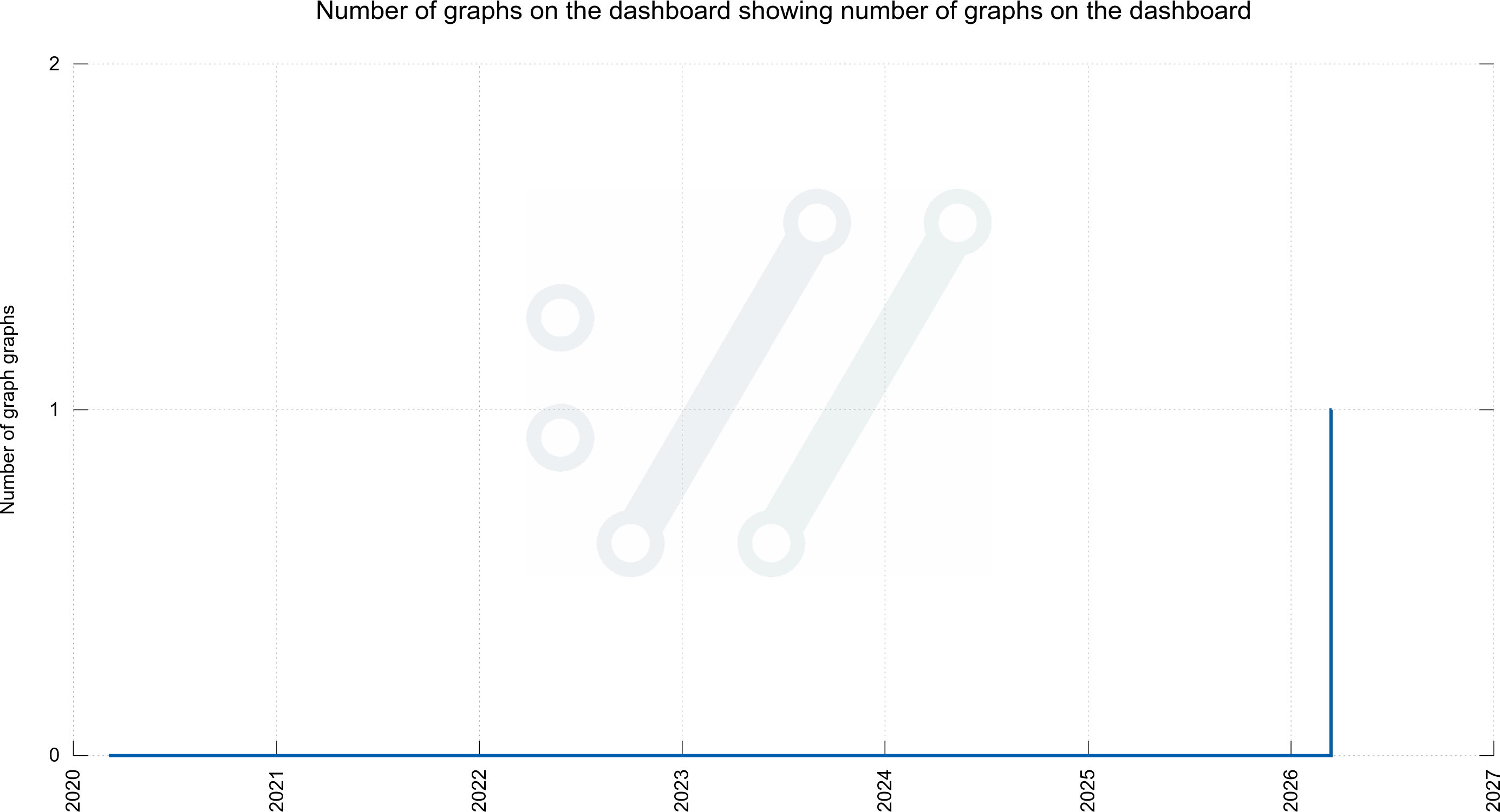
On Mastodon I keep joking about me being a graphaholic and often when I have presented yet another graph added the collection, someone has asked the almost mandatory question: how about a graph over number of graphs on the dashboard?

Early on I wrote up such a script as well, to immediately fulfill that request. On March 14 2026, I decided to add it it as a permanent graph on the dashboard.

The next-level joke (although some would argue that this is not fun anymore) is then to ask me for a graph showing the number of graphs for graphs. As I aim to please, I have that as well. Although this is not on the dashboard:

More graphs

I am certain I (we?) will add more graphs over time. If you have good ideas for what source code or development details we should and could illustrate, please let me know.

Links

The git repository: https://github.com/curl/stats/

Daily updated curl dashboard: https://curl.se/dashboard.html

curl gitstats: https://curl.se/gitstats/

A 1337 curl author

For quite some time now, I celebrate and welcome every new commit author in the curl project in the public. Recently, that means I send out a toot on Mastodon saying Welcome so and so as curl commit author number XYZ and a link to their initial curl work. (example 1, example 2).

This messaging is not done automatically. GitHub helps out by specifically mentioning in a PR when it is done by a first-timer to the repository, and I have a convenient local script that tells me how many authors we have so far, and then I type up the message myself and send it. (Sometimes I miss one, which I regret.)

This process takes me about seven point five seconds per case of manual labor. Writing an automated script to do this correctly, triggered for the right persons, would take the equivalent of many years of new authors.

For the last few months, people have more and more noticed and replied mentions about the fact that we were approaching commit author number 1337. Lots of people have said things in the style of “I should learn to program soon so that I can become number 1337”.

The number 1337, is of course just a number. I find it amusing and charming that it seems to have this almost magic aura and attraction to so many people in our community.

Today, commit author 1337 was finally announced, only three years since we announced author 1000. There are no permanent records or anything of this fact other than this blog post. Further, there is a risk that we have a duplicate or two somewhere in there so that a recount at a later time will end up differently.

Commit author 1337 became Michael Schuster who wrote this pull request, which fixed a minor build issue in the mbedTLS backend code. Thanks!

337 new authors over the last three years equals roughly two new commit authors per week on average. Pretty good. We have room for many more!

A relevant statistic in this context is also that 65% of all commit authors only ever authored a single commit.

Now, let’s go for author two thousand next…

decomplexifying curl

(I wrote about this topic in my weekly email this week. This is the blog version, somewhat extended.)

Easy to read

Two contributing factors that make code hard to read are function length and function complexity. To keep source code easy to read, understand and debug we should strive towards keeping functions short and simple. Nothing ground-breaking in that conclusion.

I know, it sounds really simple and straight forward but in a living project that goes on for decades, code develops, moves and grows over time. What started out small and simple risk gradually turning into something else.

This of course because there are so many more factors involved that need to be given focus as well. Like security, bugfixes, performance, food on the table and getting more people involved.

Graphs graphs graphs

Last week I added two more graphs to the curl dashboard showing function complexity and function length growth in curl code over the decades: one plot for the worst function and one plot for the 99th percentile in each graph. For both graphs, the 99th percentile plots shrink gradually over time but the worst offenders grow. This means that there are a few functions that with attention could improve readability and code maintainability but that in general things are under control.

One of the main points for me with graphing the project from as many angles as possible is to unveil things like this. Areas that might need attention, and then keep a check on these areas going forward. Details like these are otherwise rather subtle and not easily detected when manually browsing around.

It has been said that whatever measurement you use to track engineering progress, that will then become the goal for what engineers work towards. I hope to combat this by measuring (and graphing) as many angles as possible of the curl project. To help push us in the right direction in as many different areas as possible.

Improve

I took it upon myself to improve the situation: to reduce the size of the largest function in the code base and to simplify the most complex one. Incidentally they were different functions: the largest function was the big switch handling curl_easy_setopt options, and the most complex one was the main curl tool function setting up a single transfer.

These two functions had simply just slowly and consistently been growing over time, in size and complexity. No one’s “fault” really and not with any specific plan or intention. The graph helped me decide to act and the pmccabe tool helped me identify them. We can of course argue about the specific method or number that pmccabe presents for complexity, but I think it at least is pretty good at actually identifying the correct functions and the exact particular score it sets is not terribly important.

Both pull-requests became > 2000 modified lines monsters, but they also had immediate and distinct effects on the graphs; which ideally should mean that the code readability is now a little better than before, making the functions easier to improve and work with going forward

Complexity

The single worst function in production code had gotten quite complex. I spent a work day on the case and look at the drop on the right edge of the graph below, made after my fix landed. Most of the job was to properly split the function into several smaller ones that made sense.

The single worst offender at this particular time was the function in the curl tool that sets up a single transfer job.

There are still some pretty complex ones remaining. Room for further improvements no doubt.

Function length

The worst offenders in terms of function size in curl have been of two kinds: state machines with many states and functions handling big switches for options.

In this particular case, this was the big function handling curl_easy_setopt(), and as we have over three hundred options having them all handled in a single function made it very big. The new setup splits that handling up into multiple smaller functions, one for each kind of input.

The largest one is now at over 1,500 lines. Still on the too large side of things but way better than before.

Going forward

Yes, I am a graphaholic and I seem to keep finding new ways to illustrate project status and development using plots on timelines. I am also most likely the biggest consumer of these graphs as I monitor them daily to make sure I have full control of how we are in the project, in every imaginable aspect.

I intend to try to continue simplifying a few more of the functions in the pmccabe toplist.

Let’s see what the graph shows in another three years.

Keyboard key frequency

A while ago I wrote about my hunt for a new keyboard, and in my follow-up conversations with friends around that subject I quickly came to the conclusion I should get myself better analysis and data on how I actually use a keyboard and the individual keys on it. And if you know me, you know I like (useless) statistics.

Func KB-460 keyboardSo, I tried out the popular and widely used Linux key-logger software ‘logkeys‘ and immediately figured out that it doesn’t really support the precision and detail level I wanted so I forked the project and modified the code to work the way I want it: keyfreq was born. Code on github. (I forked it because I couldn’t find any way to send back my modifications to the upstream project, I don’t really feel a need for another project.)

Then I fired up the logging process and it has been running in the background for a while now, logging every key stroke with a time stamp.

Counting key frequency and how it gets distributed very quickly turns into basically seeing when I’m active in front of the computer and it also gave me thoughts around what a high key frequency actually means in terms of activity and productivity. Does a really high key frequency really mean that I was working intensely or isn’t that purpose more a sign of mail sending time? When I debug problems or research details, won’t those periods result in slower key activity?

In the end I guess that over time, the key frequency chart basically says that if I have pressed a lot of keys during a period, I was working on something then. Hours or days with a very low average key frequency are probably times when I don’t work as much.

The weekend key frequency is bound to be slightly wrong due to me sometimes doing weekend hacking on other computers where I don’t log the keys since my results are recorded from a single specific keyboard only.

Conclusions

So what did I learn? Here are some conclusions and results from 1276614 keystrokes done over a period of the most recent 52 calendar days.

I have a 105-key keyboard, but during this period I only pressed 90 unique keys. Out of the 90 keys I pressed, 3 were pressed more than 5% of the time – each. In fact, those 3 keys are more than 20% of all keystrokes. Those keys are: <Space>, <Backspace> and the letter ‘e’.

<Space> stands out from all the rest as it has been used more than 10%.

Only 29 keys were used more than 1% of the presses, giving this a really long tail with lots of keys hardly ever used.

Over this logged time, I have registered key strokes during 46% of all hours. Counting only the hours in which I actually used the keyboard, the average number of key strokes were 2185/hour, 36 keys/minute.

The average week day (excluding weekend days), I registered 32486 key presses. The most active sinngle minute during this logging period, I hit 405 keys. The most active single hour I managed to do 7937 key presses. During weekends my activity is much lower, and then I average at 5778 keys/day (7.2% of all activity were weekends).

When counting most active hours over the day, there are 14 hours that have more than 1% activity and there are 5 with less than 1%, leaving 5 hours with no keyboard activity at all (02:00- 06:59). Interestingly, the hour between 23-24 at night is the single most busy hour for me, with 12.5% of all keypresses during the period.

Random “anecdotes”

Longest contiguous time without keys: 26.4 hours

Longest key sequence without backspace: 946

There are 7 keys I only pressed once during this period; 4 of them are on the numerical keypad and the other three are F10, F3 and <Pause>.

More

I’ll try to keep the logging going and see if things change over time or if there later might end up things that can be seen in the data when looked over a longer period.

curlers rest on Sundays and during July

We now run gitstats on the curl git repository daily and provides fun graphs.

We have almost 11 years of source code history covered and I personally have done some ~68% of all commits. Given this long history it is fun to see some very clear trends. Like this first one: look at the distribution of commits per weekday over the entire period. The amount of commits done during weekends are significantly lower than during the work week, and the Sunday amount is clearly even lower than Saturday:

day_of_week

Similarly, we can see how the activity is spread out over calendar months. This shows an obvious correlation to the slower periods in my life, which means that July is vacation times and the numbers show it:

month_of_year

curl: ten years of more code and contributors

It feels like I’ve been doing curl forever, while in fact it is “only” in its early teens. I decided to dig up some numbers on how the development have been within the project over the last decade. How have things changed during the 10 most recent years.

To spice up the numbers, I generated some graphs based on them and to then make the graphs nice and presentable I moved them all over to a single graph using my super gimp powers.

Bugs, Linus of code and contributors over time in curl

Click the image to get a full resolution version. But even the small one shows the data I wanted to illustrate: we gain contributors in roughly the same speed as we grow in lines of code. And at the same time we get roughly the same amount of bug reports over the years, apparently independently from the amount of code and contributors! Note that I separate the bug fixed bars from the bug report bars because bug fixed is the amount of bugfixes mentioned in release notes while the bug reports is the count in the web based bug tracker. As seen we fixed a lot more bugs than we get submitted in the bug tracker.

I should add that the reason the green contributor line starts out a little slow and gets a speed bump after a while, is that I changed my way of working at that point and got much better at tracking exactly all contributors. The general angle on the curve for the last 4-5 years is however what I think is the interesting part of it. How it is basically the same angle as the source code increase.

The bug report counter is merely taken from our bug tracker at sourceforge, which is a very inexact count as a very large amount of bugs are reported on the mailing lists only.

Data from the curl release table, tells that during these 10 years we’ve done 77 releases in which we fixed 1414 bugs. That’s 18.4 bug fixes per release and one release roughly every 47 days on average. 141 bug fixes per year on average.

To see how this development has changed over time I decided to compare those numbers against those for the most recent 2.5 years. During this most recent 25% of the period we’ve done releases every 60 days on average but counting 155 bug fixes per year. Which made that the average number of bug fixes per release have gone up to 26; one bugfix every 2.3 days.

A more negative interpretation on this could be that we’re only capable of a certain amount of bug fixes per time so no matter how much code we get we fix bugs at roughly the same rate. The fact that we don’t get any increasing amount of bug reports of course speaks against this theory.

A view of a popular post

So I post frequently on this blog, but I’m not a particularly interesting person myself, I’m not really a master at writing and phrasing articles to make them thrilling and irresistible and I basically only deal with really geeky and technical subjects. It means there’s an average of perhaps 200 views per day.

The other day I wrote my multipath tcp post, and someone submitted it to reddit. It turned out to become my most read posting on my blog ever. By far. I think the “views per day” graph looks pretty cool:

visitor graph from daniel.haxx.se/blog

Some stats on curl development

Counting curl 6.0 and up to curl 7.19.3 we’ve done 78 releases during the 9.4 years it took.

In this time, we’ve mentioned 1259 bugfixes and 389 notable changes.

This makes one bugfix done every 2.7 days. One release done every 43rd day with an average of 16 bugfixes done in each. The longest interval ever between two curl releases was 139 days, back in 2000 when we worked to release the first version 7 release (known as 7.1).

To compare with how our work has been more recently, doing the same math limited to the 20 latest releases only (the 3.3 years since and including 7.15.0) shows that we’re still on 2.7 days per bugfix (although we know that the code base has grown steadily for years) but we’re now on 61 days between releases and 21 bugfixes/release…

All this info and more will be visible on a web page on the curl site soonish, I’m still working on polishing it up.

What other useful or useless but interesting numbers could be extracted from this?

4 ohloh improvements I’d like

I am a stats junkie so I like my stats in large amounts. But I like the stats to be right and as accurate as possible, and when I look at what ohloh produces I like the concepts and ideas in general, I just think their implementation is lacking in a few vital areas that need improvement:

1. There are no dependencies or hierarchies between packages, so “I use this” counters get worthless since people mark end-user packages they use. Low-level support packages and libraries that are used indirectly don’t get many “use counts”

2. Doing very few commits in a very well used project with few authors gives you way way more points than doing a bus-load of commits in something less used with many fellow contributors. This makes the top-list of people very skewed as some of the top-64 people only did a few hundred commits ever. I doubt many mortals would consider someone who only ever did 300 commits to be a top community person. At the very moment I write this, the #1 ranked person has done 20 commits during 5 months…!

3. Too few versioning systems are supported, leaving out huge chunks of the open source world. Bazaar, mercurial and a few more are a bit too popular to be ignored without the results getting skewed.

4. I’d like to see the “number of users” of products as a percentage, as the total number of users they show include all contributors to all projects. Out of the 140,000 users (which undoubtedly include a lot of duplicates), it would surprise me if more than 10,000 have actually registered what products they use. I’ve tried to find the exact number but I failed. So 3,000 users don’t mean 3,000 out of 140,000 but 3,000 out of 10,000…

ohloh vs statcvs

I’ve played a bit with statcvs lately and I generated reports for the curl repository. It turned out rather interesting (well, assuming you’re a statistics geek such as me) especially in comparison to the data and stats ohloh.net presents for the same code:

[the images have been lost in time, like tears in rain]

Executive summary:

  • I’ve done 82% of all code changes.
  • We seem to grow at roughly the same pace (both number of code lines and number of files) over the last years.
  • The lines of code per file count seems rather fixed

Oh, that initial big bump at late 1999/early 2000 was due to a lot of “wrong” files such as configure, config.guess etc were committed and subsequently removed. It is a bit annoying to have there as it ruins the data somewhat but I’ve not managed to fool statcvs into ignoring that part…